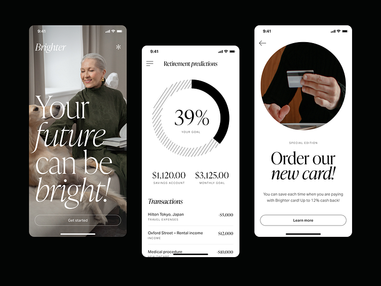
5th Retirement planner
🌞 Hey folks!
A fifth shot from the series: the same product but with a different visual theme. Today I prepared a minimalistic black-and-white UI combined with sophisticated photos. A neutral color palette and classy typography create a modern look.
You can find here 4 previous shots that I was exploring, with completely different styles:
🔮 Version 1 • 👵🏻 Version 2 • 🦩 Version 3 • 🌋 Version 4
Which version do you like the most?
🔥 Stay tuned it's still not over in this series.
We're available for new projects! Drop us a line at ux@netguru.com.
—
Show us love! Press "L".
Want to see more projects? Visit our profile or Netguru.com and remember to follow us!
More by Netguru View profile
Like
