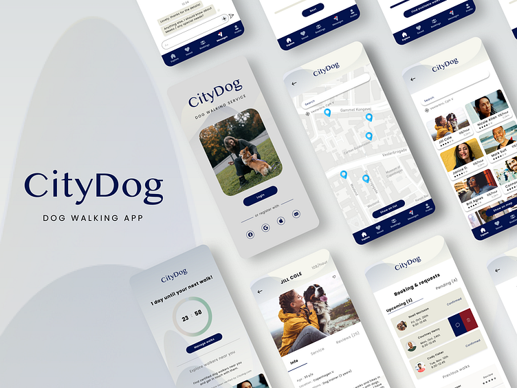
CityDog - Dog walking app
CityDog is a dog walking app as part of the Dribbble’s Product Design course.
Problem
First is the geographical gap. There is a missing gap in the danish pet/tech industry, where you can hire certified dog-walkers to walk your dog on a request system.
Second is trustworthiness and efficiency. Dog owners are wary letting strangers take their furry family out for a walk. With a busy schedule, dog-owners most often would ask help by friends and family, because of efficiency and safety.
Goal and solution
Living in a fast-paced world, we want to make it easy, safe and fast to find a dog-walker in your area that can walk your dog at your specific time / needs. Creating a simple, efficient app with few but safe actions is key to this project.
My role
I both had an UI and UX role in this project:
Performed user and market research, and c
onducted interviews.
Idealised solutions (based on crazy 8 exercises and empathy mapping).
Mapped out user flows, personas, and built sets of wireframes.
Designed UI elements and components, visual identity, and design system.
Created prototypes with animations and interactions.
1 . Research
I conducted 5 qualitative interviews supported with articles and online research on the Danish market.
All of the above confirmed that there is a missing service to be found online, in the form of an app in Denmark.
On top of that, the research showed that most dog or pet owners rather ask friends or family in times of need to walk their pet, due to two factors:
1 - it’s easier and faster to ask or get a confirmation with close relatives.
2 - it’s more reliable to ask someone who knows you and your pet.
The next step was to define the user persona based on all the information gathered.
2 . Ideate
User flows & Wireframes
To align with the user persona, who's daily life is busy and hectic, the app had to be familiar, easy to use and reliable.
Features such as personalised search filters and adding information up front about the walkers service and expertise helps provide a more tailored and quick experience.
The wireframe work helped test and validate the ideas for possible solutions, with the focus on a clean and simple design. I wanted to avoid unnecessary steps to make sure dog owners would stay and use the application. To do so, the user first have to type in the date and service needed, before seeing the walker options. That way, dog owners know that the shown walkers are already filtered and ready to fit its needs.
I also included a non-committal path in the journey where users can browse walkers near them without having to commit straight away, and allow users more freedom when searching for something specific.
3 . Design & iterate
Following the research and wireframes, the main points for the app were trustworthiness, efficiency and simplicity.
The typography, colours and other visual elements were chosen to reflect a clean and professional feel with a touch of aesthetic, easy and nice for the eyes.
Design System
Components and style system helped provide consistency, alignment and speed.
4 . Prototype & test
The design was tested by two dog owners and a walker, with 3 tasks:
search a walker for a specific date / time
view a walker's profile
book a walk
All users were able to complete the task and overall felt the process was easy and intuitive to follow.
They also gave some suggestions to change including:
More spacing, and scrolling, mainly on walker's profile, as there's a lot of information gathered.
A support page and wireframe, if there's an emergency during the walk: what happens?
More subtle page turn and animations, to make the experience more smooth.
Test out the prototype yourself!
Takeaways and next steps
Next steps is to create wireframes and design same app, but for dog-walkers!
THANK YOU!


