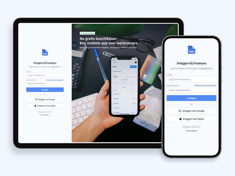
Login to Employes 💙
Login is the starting point for our customers.
We want unity across the board and streamline their experience from start to end.
The Challenge
There were two key reasons to revisit Login. The first reason being the visual inconsistency between the login environment and the application. We want a streamlined experience for our customers from start to end.
When logging in, visitors were presented with a large space used for aesthetic purposes only. The goal was to maintain the same level of aesthetics, while also introducing more value to our customers when logging in.
The Result
We took the same style and brand guidelines we use within the application and applied them to the context of Login. This immediately introduced familiarity and consistency.
For the unused space we decided to highlight product updates. Introducing new features to people even before they are logged in. With this approach we maintain the same level of aesthetics while also delivering more value.


