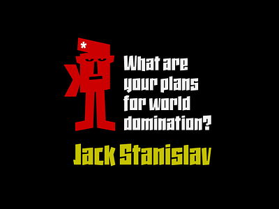
Jack Stanislav Typeface
Very condensed typography, thick line and fun look for headlines and advertising where you are looking for saving space and originality at the same time.
The upper inclination of the letters, the combination of horizontal with inclined forms, the ascending and descending short, and the lower elongation of some antlers will allow you to print varied styles with a lot of movement according to the context of the design.
FULL VERSION & COMMERCIAL LICENSE: https://defharo.com/fonts/jack-stanislav-sans/
More by deFharo View profile
Like
