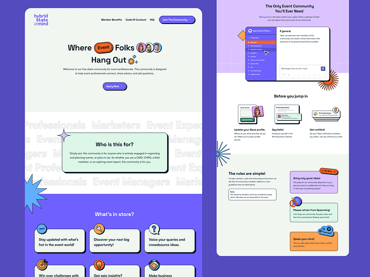
Hybrid State Of Mind Community | Landing Page Design
Super happy to share one of my most interesting and rewarding projects of 2022. The landing page was featured on top web design inspiration sites including Webflow's Inspo , Landingfolio, Land-Book, One Page Love.
Check out the website in all its glory: https://hybridstateofmind.com/
Hybrid State of Mind is a Slack community for people in events, around events and behind the scenes of events. It's a collaborative space, encouraging conversations that go beyond just virtual and in-person events. The term 'Hybrid' speaks for the future-ready concept of events as well as the versatile mindset of the individuals in this community.
The website and branding reflect the dynamic personality of the space, and the people who make it. This is the future of events - this is Hybrid.
Designed for Zuddl
Vishal S Krishna | Web & Visual Design
Siddhi Surte | Logo and Identity
A dynamic community for event professionals demands a fresh and visually impactful approach.
Playing with the typography and colour palette, we defined a neu-brutalist material style - using retro shapes and content badges as a direct way of representing thoughts and ideas for a community based on text conversations.
These are complemented with sharp colours, strong shapes and topped off with smooth interactions. The overall web experience is playful yet informative.
Plus, our button interaction is so addictive that people can't stop playing with our hover state ;)


