DailyUI #001 - Subscribe to Newsletter
Zoom-in (click image) for better image quality.
Good day Dribbblers 👋
I'm excited to share that I just took the dailyUI challenge! This is my first work, and I'm looking forward to improving my design skills and sharing more with you.
Design Hint 💻
Create a sign up page, modal, form, or app screen related to signing up for something.
The Idea 💡
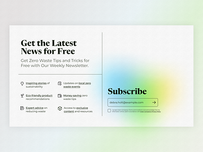
Get ready to join the zero waste movement and sign up for my kickass newsletter! Today's UI design is a thing of beauty - vibrant colors, sleek interface, and a super annoying checkbox that you definitely don't want to forget.
Final Thoughts 🧠
I'm sure you'll agree with me when I say that sometimes, a little splash of color can make all the difference. Well, that's exactly what happened when I stumbled upon this gradient that completely captivated me! I initially planned to go for a simple form, but the gradient inspired me to switch things up and add some less standard fonts as headings. While I'm pretty happy with how it turned out, I can't help but feel like there's still more room for improvement. What do you think? Do you have any suggestions for how I can take this design to the next level?😄
Share the love, press "L" or "F" if you ❤️ my work!
If you want to stay up to date with my work, head over to my profile and follow me. 🎨
