Stellar
Hi. Happy new year to you all.
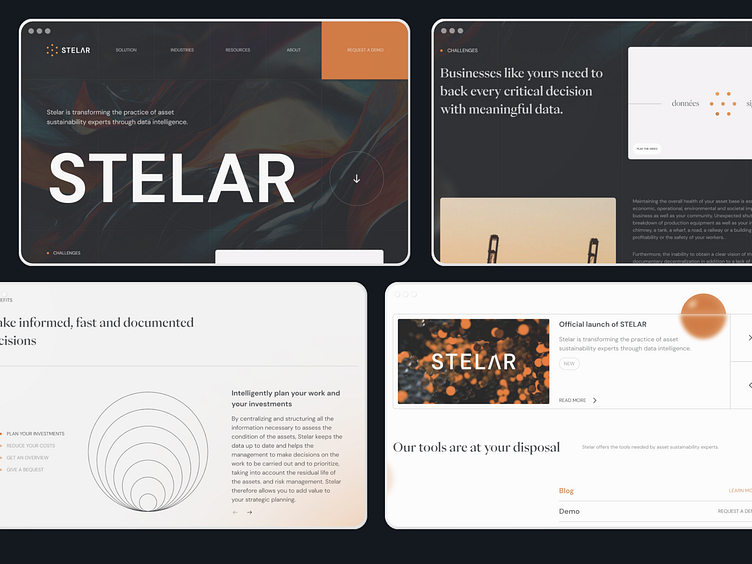
In 2023 I'm starting a 52 week challenge, where each week I'm going to redesign some real designs out there to keep my engine running and to add some mental libraries to my references. Sometimes I'll just recreate, sometimes I'll do a completely new proposal (which will turn into a case study). In this case, I recreated the Stelar website to study its grid and its design, which I think it is awesome.
The original one was designed by Ulys Design (https://www.ulys.design/) and you can check it out in here: https://www.stelar.ai/
I made some minor changes to it, and it was a very nice exercise for me, and I'm really looking forward to do this each week to keep exploring new and different things between my day job as product designer.
I added the aimsy logo in the footer just to show a friend of mine what our company would look like in a footer. Don't take it for real, once again the original was designed by Ulys Design (https://www.ulys.design/)

