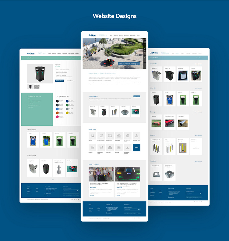
Apnova
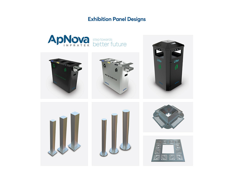
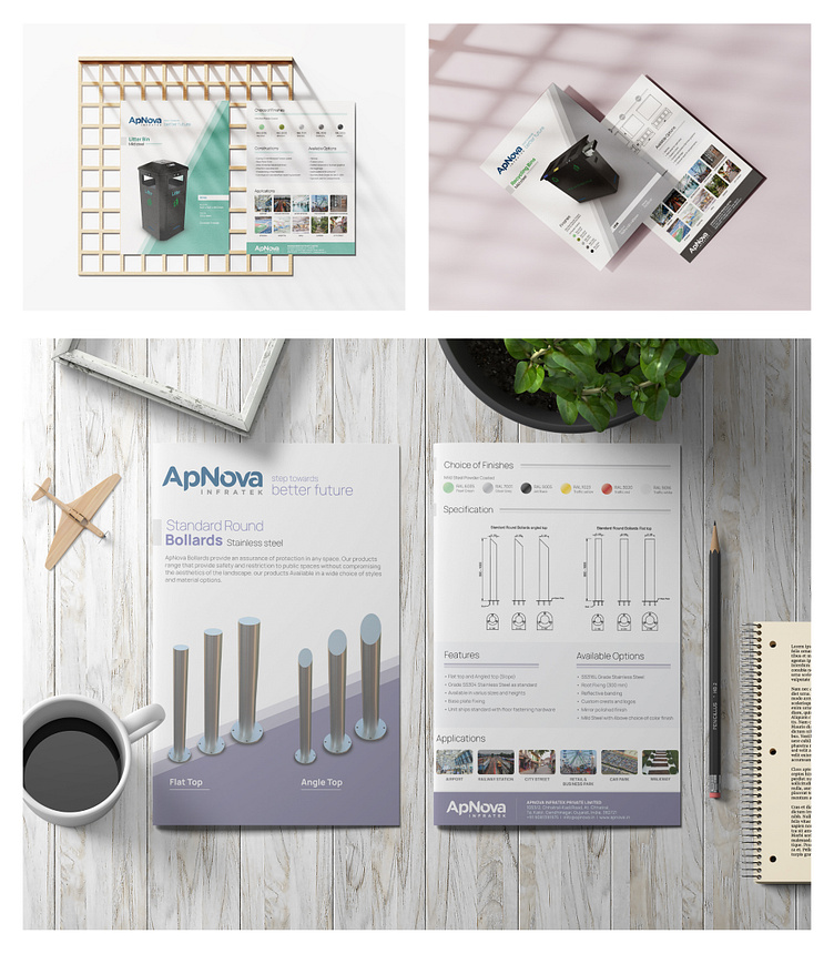
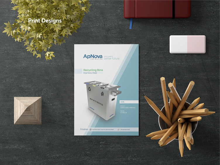
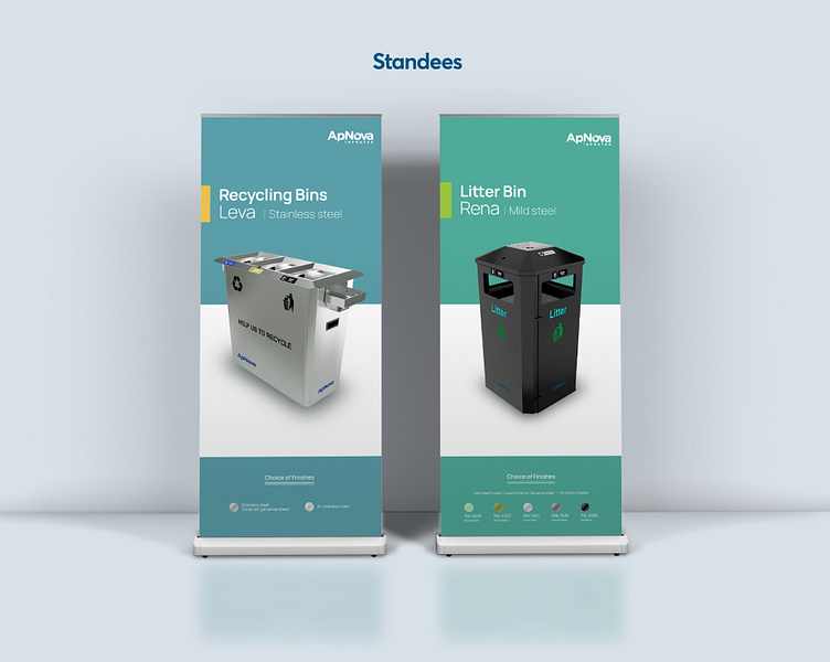
ApNova offers a wide range of products ranging from the recyclable waste separation system to bollards nd tree seating and grill. From systems with fire or vandalism protection.
The Challenge
ApNova Infratek was a startup, and we have to go for marketing before production, So we can estimate demand in the market and based on that we can plan the production. The Target Audience was primarily Europe, USA and India. So, we have to start from scratch without an actual product.
Solution
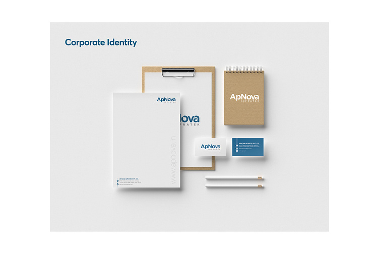
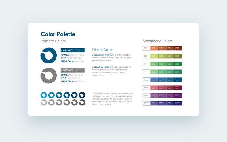
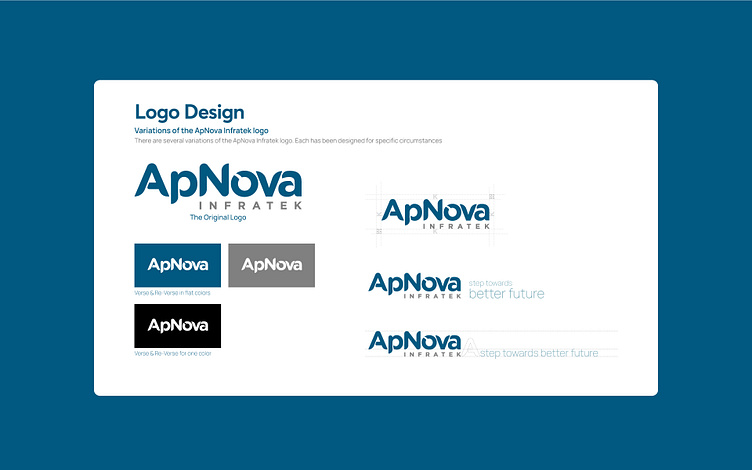
As we didn’t have actual products, we have used the 3d models which was used for prototyping and render some photo realistic images, Parallelly we worked around several logo designs that deliver a unique impression on a brand. However, choosing the color palette was a crucial task for the team. Keeping in mind affects any product. Choosing the Blue and Grey combination emphasized the subtleness in delivering quality services and products with a visual guidelines and brand identity which represent companies’ image and vision. To tackle the most common problem among brands like ApNova was to create awareness about its product. The team researched thoroughly to understand the best practices to apply.
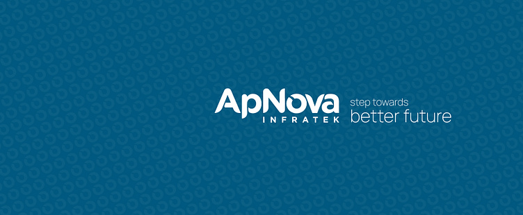
When you use corporate branding, you want an overall message. Business branding is an essential facet of an organization’s overall marketing and advertising strategy. At Zero, we’re passionate about exploiting creativity in Branding Identity. It starts from a simple Logo Design to an entire umbrella of Design Services to establish your Brand Identity.