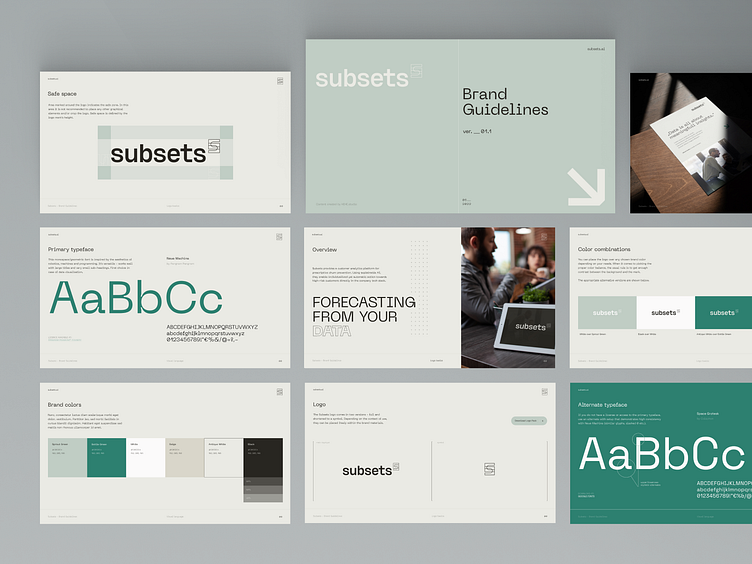
Subsets - Brand Design & Guidelines
Subsets - Forecasting from your data
Subsets provides a customer analytics platform for prescriptive churn prevention. Using explainable AI, they enable individualised yet automatic actions towards high-risk customers directly in the company tech stack.
In other words they offer bespoke consultancy for subscription-based companies and analyse the obtained data with machine learning algorithms to boost most critical business processes.
The Logo
Logo idea is represented in a logical, mathematical way. Simple, elegant, as if it was just purely data with just a pinch of branding. The logo is formed by combining two mathematical symbols from set notation. By overlapping they also create new sets of data within them.
Math notation (set symbols) are used as one of the brand’s visual element along dot sequences representing stacked data.
Brand Design
Subsets is a brand offering modern solutions, willing to evolve. Their communication is simple, easy to understand and based on non-distracting visuals. Straight up honesty is what Subsets speaks. Too much ornaments could result in unnecessary clutter which contradicts with Subsets’ way of communication. As stated in the brand guidelines, Subsets communicates in an authentic, direct messaging style.
A great deal of inspiration for the overall brand perception came from Scandinavian and Japanese design. This, combined with a minimalistic approach to visuals, results in a fresh, professional and slightly sophisticated look that separates the brand from the crowd of similar tech or AI-centered brands.
Remember to hit "L" if you love it 🖤
__
Do you like our style?
Feel free to contact us - studio@hehe.studio


