Frutero / Package Design

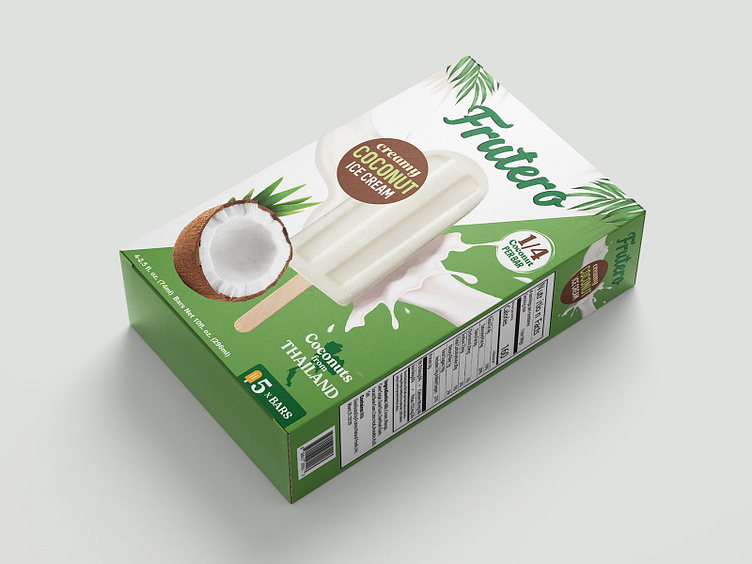
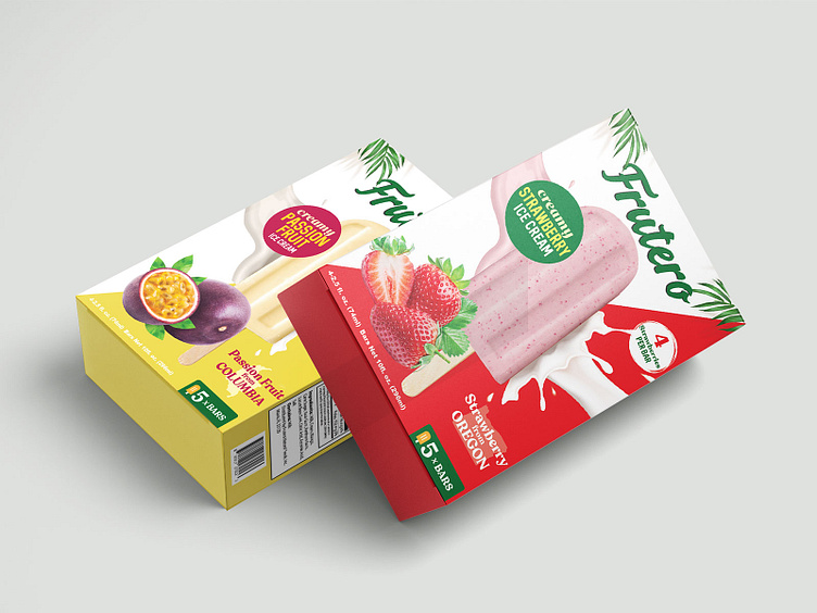
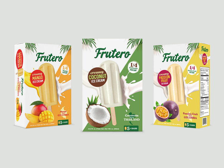
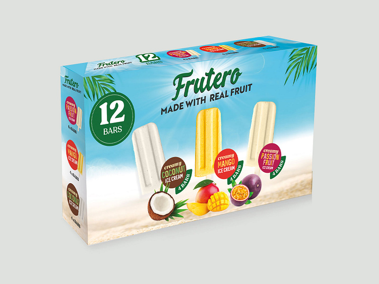
Frutero is a 100% Real Fruit Ice-cream brand on a mission to make the worlds best ice-cream. Unlike sorbets they combine real fruit with dairy to make delicious ice-cream. Our second brief was to design their packages for their ice-cream bars.
Frutero already had tub ice-cream packaging, therefore the boxes had to be inline with the tubs, bu we also needed to add a few small yet effective touches to the branding. The most obvious design element to bring to the boxes was the diagonal stripe and color palettes. Since there is more room on the boxes we were able to bring the tropical leaves to add the exotic element. Fruit and milk play a crucial role in the bars, so it was important to have this visible in the package itself. With all the flavors the milk splash comes from the right and the fruit splash hits the bar from the left. Proud to be importing fruits from local farmers from around the globe, where the main ingredient comes from is also advertised on each package. Bold and contrasting colors also are very effective to make sure the name of the flavor pops. The three rule of thumb for good package design is - attractiveness, uniqueness and effectiveness. We believe we have covered all three with our visuals.