Invites App / Branding & Mobile App UI/UX
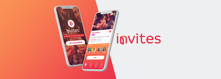
Invites is a mobile app that was created during the pandemic but its use was for after the pandemic. This app was designed to bring people together in real life. The user can either make or join events that are private or public.
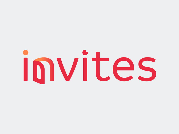
Our first brief was to design a logo for the mobile app. After careful market research we began the design process. In mobile apps it is good to have an original, memorable icon which can be used alone or with the logo. Gradients are very powerful because they help the icon of the app stand out from the rest. A small touch in the icon giving it a 3rd dimension and taking out of the flat form is also very effective. When designing the logo we kept these in mind and tried to think of symbols that best represented the concept of being invited. That is when the idea of an open door came to mind. The door is used to go in and get out of rooms, buildings, houses, restaurants, pubs, cinemas…. Also a digital door can be used to go in and out of digital rooms etc. So this door was true for the physical as it is true for the digital. The letter N was the most fitting to be played with to portray the “open door”. We also made use of gradients to give us a third dimension to the icon. When choosing a typeface we looked for a font that is modern but also a bit more relaxed and fun. That is why we chose Branding as our font. It is a typeface that is specially designed for meeting contemporary aesthetics and functional needs. It encapsulates a wide range of nuances and combines seemingly opposite elements such as technology with friendly round shapes. For our color palette we wanted to use warm inviting colors that is why we chose red and orange and their gradient.


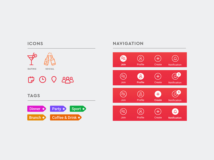
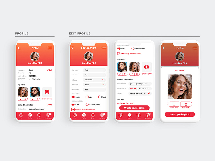
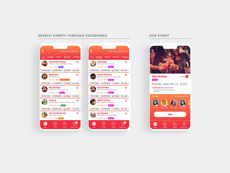
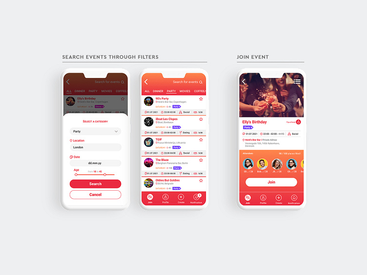
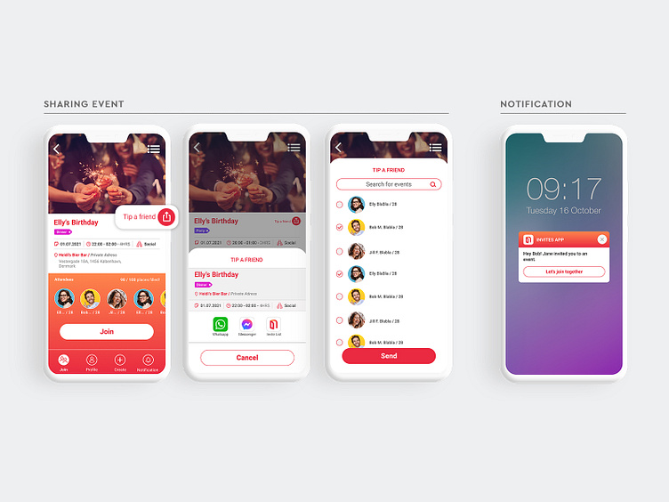
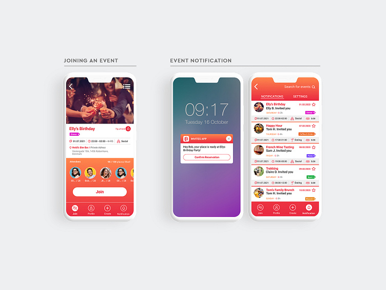
After designing the logo we moved forward to designing the UI of the mobile app. First we made the wireframe of the app to make sure all the screens and movement of the user was covered. Once we were happy with the structure of the wireframe we began the design faze. Because of our warm palette we needed to have an excellent balance of both colors plus white so that it would not look overwhelming. By using the gradient at the header and using the red at the footer made the real content in the middle more visible. Whilst designing we noticed that we would need a secondary palette for the categories / tags. We chose pop colors to make each category quickly visible and understandable by the user. We wanted to add a little fun / humour to the icons so for the dating icon we chose a martini and used two clinking beer bottles to describe the social events. It is with small touches like these that make a difference in the user when selecting a favorite / go to app. At the end we came out with a UI that is up to date with modern apps, it is easily nativgated and user friendly.