Authorable / Branding & Web Design UI
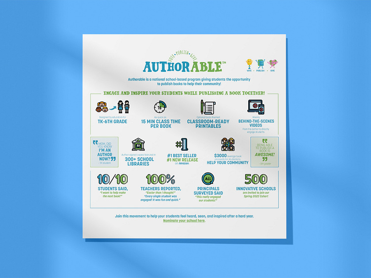
Founded in 2020 by educator and speech therapist Susie Harder, Authorable is a California based national school-based literacy program from Kindergarten to 6th grade students that directly includes them in the book writing, creating and publishing process. Each week the author communicates with the students via video messaging and through a voting process they decide on how the story develops, once the story is written and illustrated they move forward to the publishing stage and finalize with a book signing where all the proceeds are given back to the community. This program is designed to help strengthen positive character traits, create a unique bond with literacy, and build student involvement within the community.
When we first met with Authorable we loved their project and immediately wanted to work with them! They already had a logo and a website but wanted to rebrand for the upcoming new academic school year.
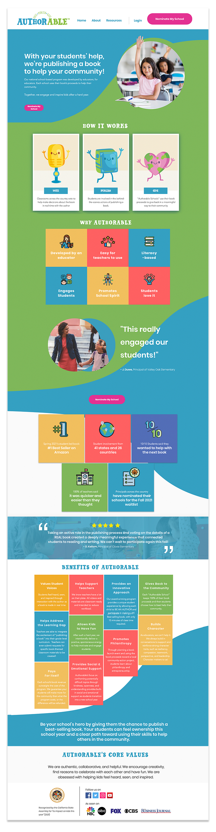
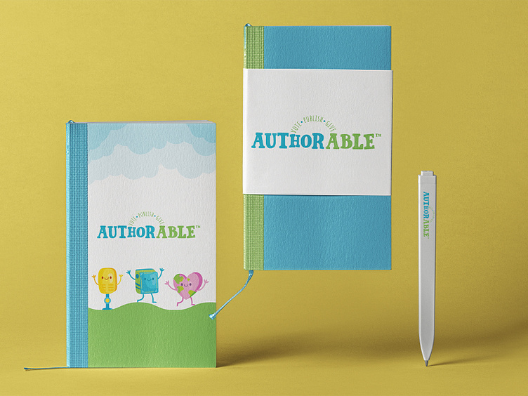
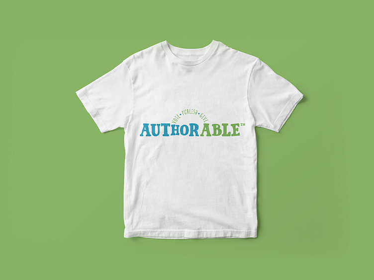
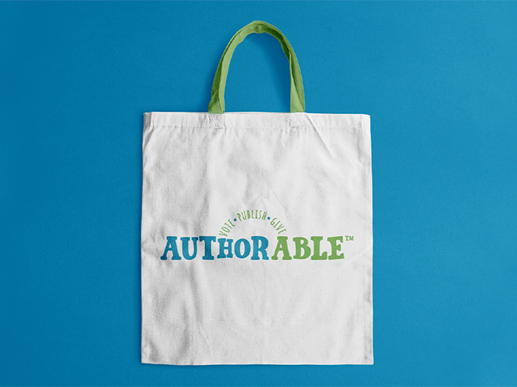
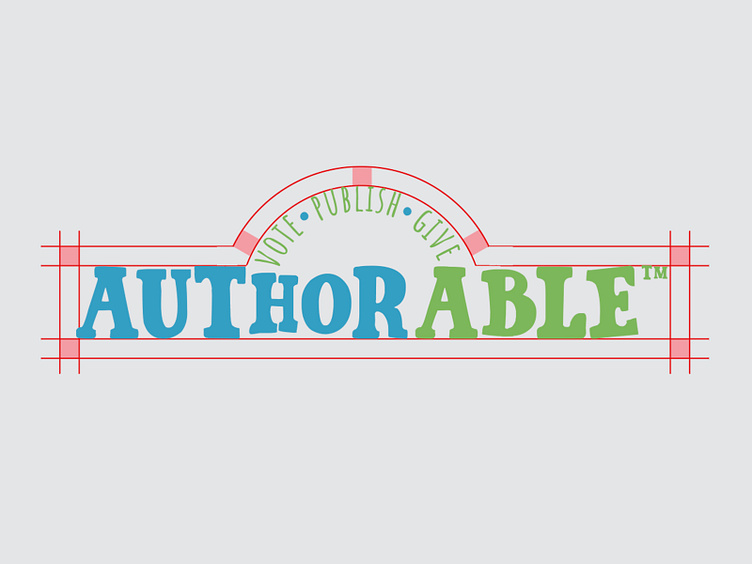
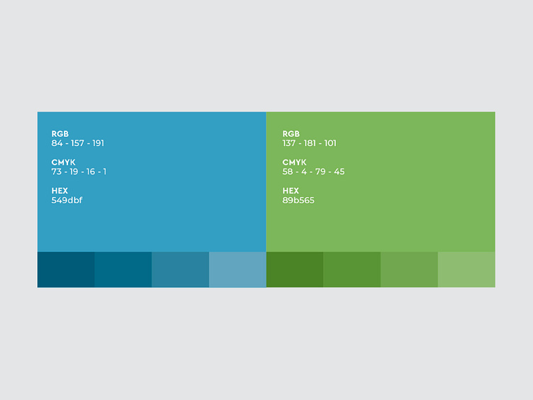
Our brief was to design a logo that would be both professional but would also reflect the spirit of the students. We wanted to highlight “Author” and “Able” which is why we chose two different colors to make them stand out. For the typography we wanted to reference woodblock printing from the first printing houses. That is why we chose a serif font. To make the typography more playful we played with the size, placement and added curves. Our choice in color was to deliver positive feelings to the Gen Z’s peace, growth, health and environment.


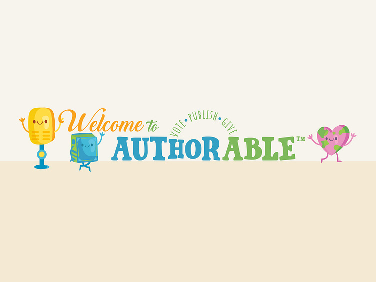
After finalizing our logo, we moved forward to illustrating the pillars of Authorable; Vote, Publish, Give. They already had a microphone character called “Mike Tap” however he was a bit flat. We began by looking into different types of microphones and decided to make him a bit less flat but to keep an illustrative character. For the word Publish we created a book character to join the team and finally for giving we made a heart shaped world character. By turning these pillars into characters, they became approachable and inline with the imagination of these students. We wanted to make it cool and also easy going, like it is not meant to be a commodity they can’t handle or get into.
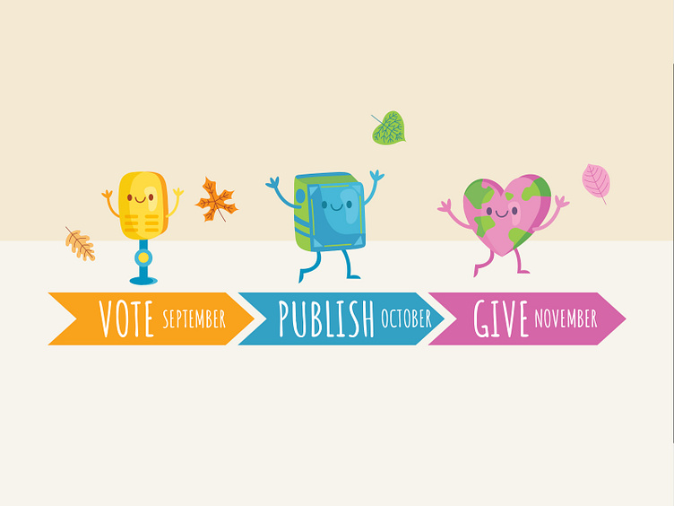
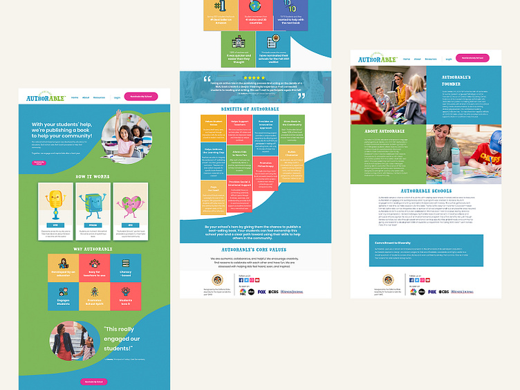
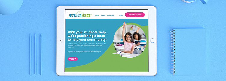
Whilst the website is to attract principles and schools to join the program it also needs to reflect the brand. We carried our brand colors, typography and characters to the site. We made sure that each bullet point was highlighted about the significance of the program as well as showing the excitement and pride / honor it brings to the children who have participated in it.
We would later on continue to work with Authorable in helping create their sell sheets and templates for their social media accounts.