Farmland Checkout
Project Info
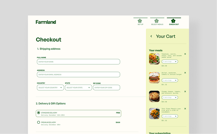
I am excited to share my latest project for Farmland, a farm-to-table meal delivery service! For this project, I focused on creating a clean and modern design that showcases the fresh, natural ingredients used in Farmland's meals.
Page Rationale
The checkout page for a subscription delivery meal service was designed to provide the consumer with an efficient and user-friendly experience.
The positioning of content on the page is an important consideration. The consumer can quickly view the specifics of their purchase by placing the cart information, subscription switch, discount code, and total on the right side of the page while simultaneously entering their mailing address and picking delivery and payment choices on the left side of the screen. This enables the consumer to quickly evaluate their purchase and make necessary adjustments before finishing the checkout process.
It is also critical to include prior parts of the checkout process, such as the setup and meal selection, to ensure that the customer understands where they are in the process and what information is required to finish their purchase. This can assist in avoiding misunderstanding and minimizing the number of abandoned carts.
A discount code section on the checkout page might be a handy feature for consumers who have received a promotional code. This makes it simple for them to add the discount to their order and increases conversion rates.
Overall, the checkout page is designed to prioritize simplicity and convenience of use for the client in order to make the process of making a purchase as seamless as possible.
About Me
Hey peeps, I'm Florencia! As a UX/UI designer, I create intuitive and visually appealing digital products. I have a strong track record of delivering high-quality designs that look great and meet the needs of my clients and their users. I'm known for my attention to detail and ability to work independently. If you need a skilled and reliable designer, I'd love to bring your vision to life!
Learn UX/UI
👉 Enhance Your UX/UI Design with These 5 Cognitive Psychology Principles
👉 Design based on goals, not tasks
👉 3 reasons why digital products fail
✺✺✺✺✺✺✺✺✺✺✺✺✺✺
I'm Booking New Clients Now!
📧 flxrenciaemilia@gmail.com
Page Rat
Excited to share my latest project for Farmland, a farm-to-table meal delivery service! For this project, I focused on creating a clean and modern design that showcases the fresh, natural ingredients used in Farmland's meals.

