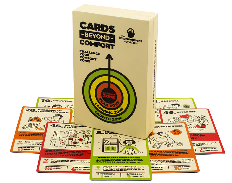
Logo, Illustrations and Packaging for card game
The Improvement Artist is a collaboration of young entrepreneurs on a mission to push you beyond your comfort zone. Their new product, Cards Beyond Comfort, is a deck of cards with 52 personal development challenges that are split into three categories – physical, mental and social. Each challenge gets slightly harder as you progress through the deck, complete the challenges one at a time and conquer your fears!
The founders first contacted me after a Google search to find the designer behind the new Stack 52 branding that I recently did as they were looking for a creative with previous card design experience. But before we started working on the actual cards and packaging for the deck, we collaborated on the logo design for their brand. The final logo concept was the perfect epitome of the inner journey.
After logo was created, I worked on a bold and colorful packaging concept, creating a set of icons and visuals and establishing a visual tone which would later apply to the cards and illustrations for the challenges.
And then came the heavy lifting part – I had to first sketch and then digitize the 52 card illustrations. I used a simple, line-based illustration style with a single color for highlights – green color for Beginner difficulty, orange for Intermediate, and red for Advanced. Inspiration came easy because I was familiar with some of the challenges, being a personal development fanatic myself.
I feel blessed to have had the chance to collaborate with the amazing founders and work on such an inspiring project. Together with the Stack 52 branding and card design, this is easily one of the top three most fulfilling projects I have done for clients in the last 7 years. Thank you, Universe!


