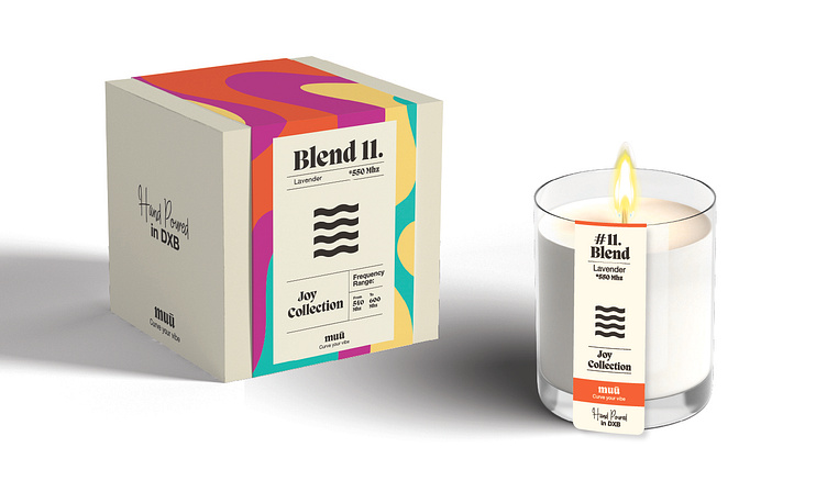
Packaging for upscale candle brand
Muu is not your typical candle company - they are different in more than one way. Their candles are prepared with special organic essential oil blends and each collection uses a QR code to help you tune in to the right vibe. The candles are also hand poured in Dubai.
Colors were the foundation for this packaging and so a lot of careful thought and energy was put into developing the patterns and color schemes. The abstract color patterns were crafted to remind of molten color wax and each color palette was carefully arranged to represent each of the four themes/collections.
A minimalist symbol was added to each collection label to represent the feeling behind each theme (joy, love, courage, etc) and add a more custom feel to the labels. The four symbols I came up with were a great match for the wavy color patterns.
Candle tags were based off of the main labels, only carrying the most relevant information from the box. Even if the main packaging got lost, the candles would still be eye candy.
Toward the end, I created a set of handmade icons for the back of the packaging.


