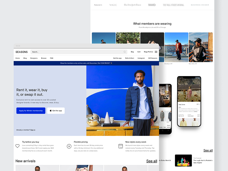
Seasons Homepage
One of my favorite things about our old homepage was that we'd update it for Spring, Summer, Fall, and Winter. We'd take new editorial photos, update the primary colors, and iterate on copy. This also helped us constantly review and improve the way we communicated our value proposition.
We'd add subtle improvements like promotional banners, contextual links, and gifting. We also used it as a place to celebrate our members and what they were wearing. This helped membership feel more personal and real. All in all, we probably went through over a dozen different versions of our homepage in the first 2 years.
More by Regy Perlera View profile
Like
