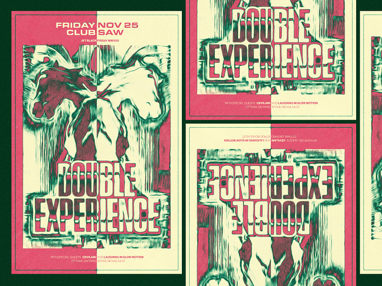
Gig Poster: Unused concept
Hey dribbbsters,
Here’s an unused poster concept from a while back that I did a little messing with.
It feels fun and slightly subversive to go absolutely hog wild with effects. Throw a gradient map on there. Run it through a halftone template. Run that through a bunch of photoshop filters. Invert the colors. Run it through 18 adjustment layers. Add more grain.
It's fun to work in an “only way out is through” mindset. Instead of using command z, you just keep going. Gets you in trouble, but also gets you to some weird coolness too.
Do you have any weird processes or methods to shake things up? Let’s talk shop.
Hope you’re swell.
More by Brent McCormick View profile
Like
