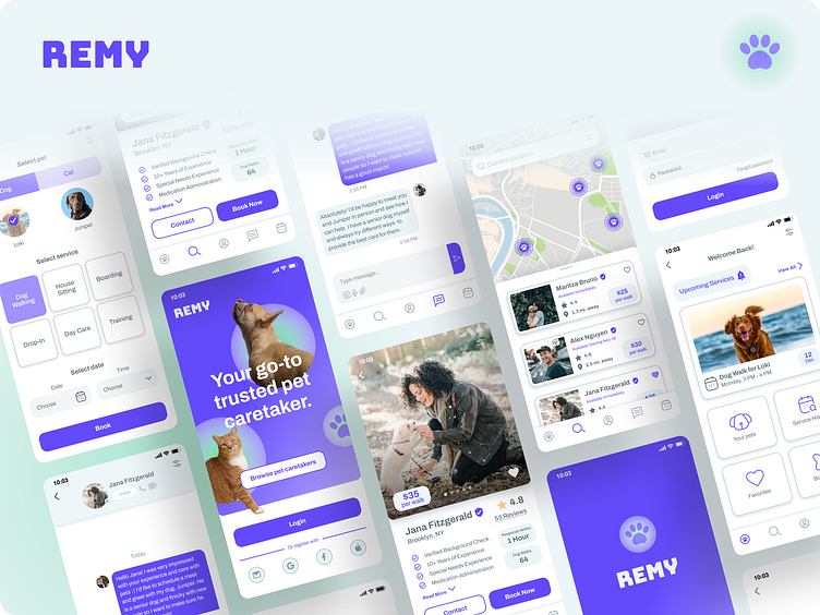
Remy - Pet Caretaking App
Problem:
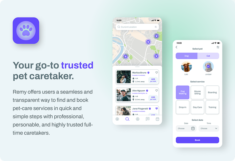
Dog owners are wary to use pet caretaking services where strangers look after their furry family. They want someone they can trust who is experienced, patient, and kind to animals.
They also want a simple, transparent, and high-quality service that doesn’t feel like a daunting task to use and set up.
Solution:
Create a reputable, friendly, and trustworthy pet care service in the form of a digital app that has seamless navigation where setting up an appointment is accomplished in a breeze.
My Role: Full-Stack Designer
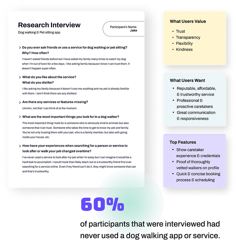
☑️ Performed user and market research
☑️ Conducted interviews
☑️ Brainstormed solutions both individually and as a group with a fantastic mentor and course cohort (utilized crazy 8 exercises and empathy mapping)
☑️ Built user flows, personas, and wireframes
☑️ Designed UI, visual identity, and design system
☑️ Created prototypes with animations and interactions
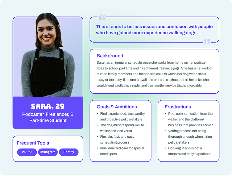
The User Research

Defining Personas & the User Journey
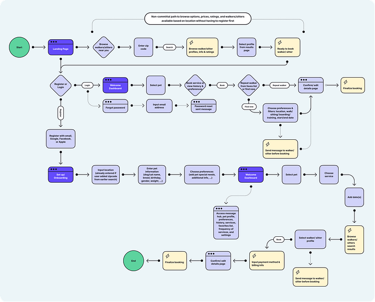
I wanted to focus on ease of use as well as provide less cumbersome and intimidating steps in order to attract hesitant users. I included a non-committal path in the journey where users can browse walkers near them without having to go through the full onboarding process upon first use, that way they can test the waters and feel more autonomy when browsing the service.
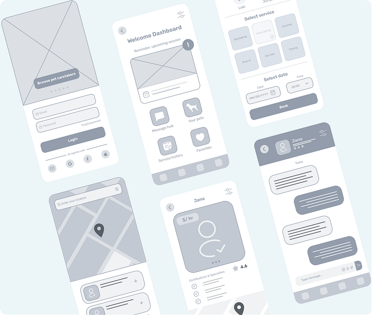
Iterating Wireframes
During the wireframing phase, I iterated the service booking page. The second version below shows a more streamlined process with the addition of the ‘Select Pet’ tab and the user now having the ability to select a date to book an appointment while on the same screen.
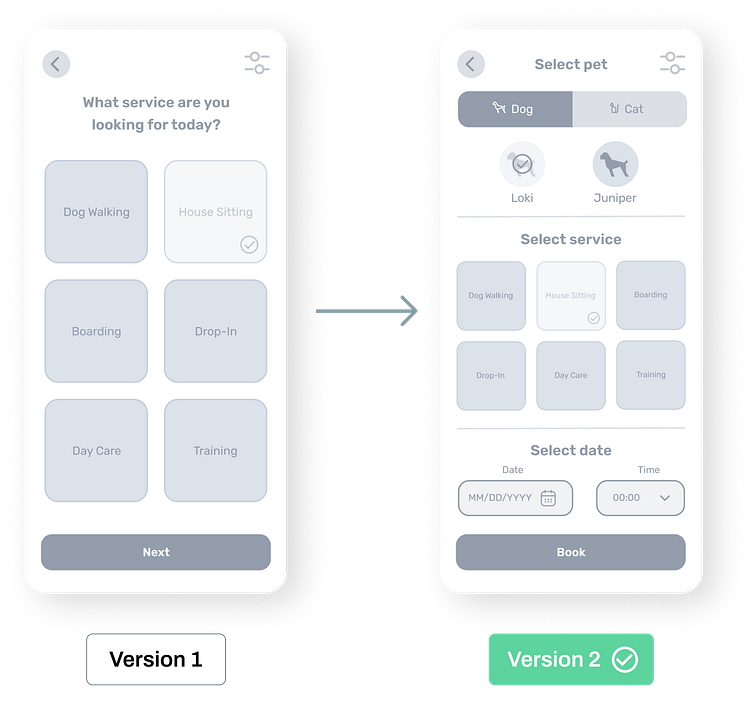
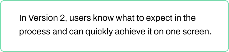
Not only is this format ideal for our target users who are pressed for time and looking to achieve booking in quick and easy steps, but it also allows for transparency and a bird's eye view of all steps from the start as opposed to having that access later into the process.
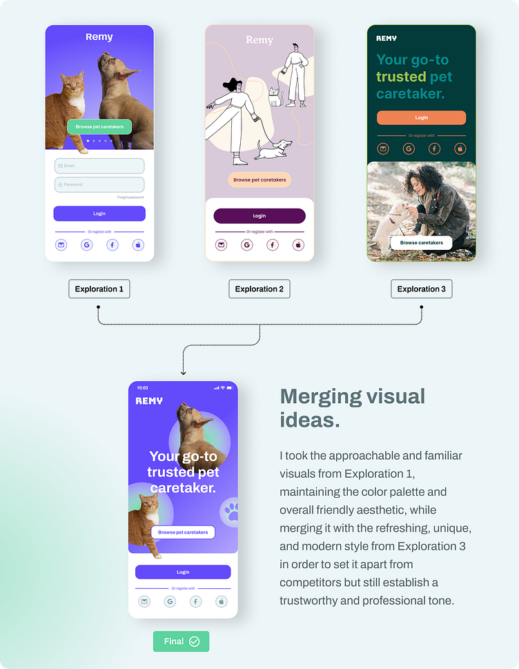
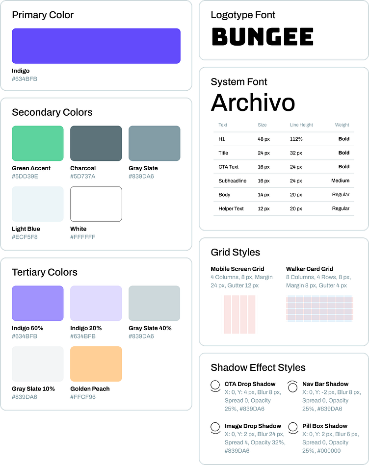
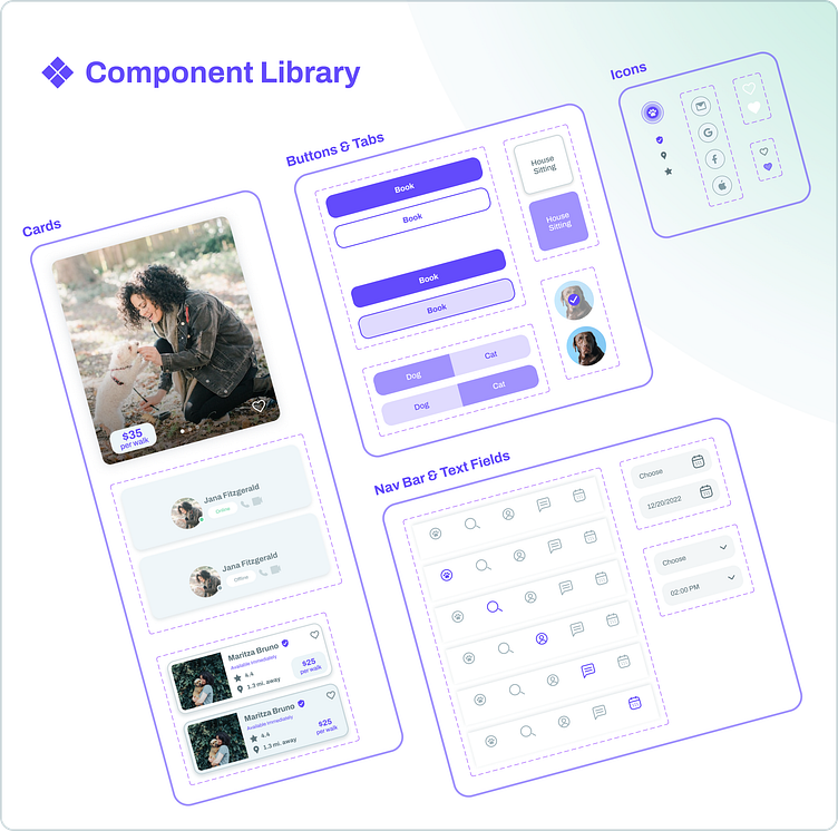
Visual Identity & Design System
Usability Test Insights & Prototype
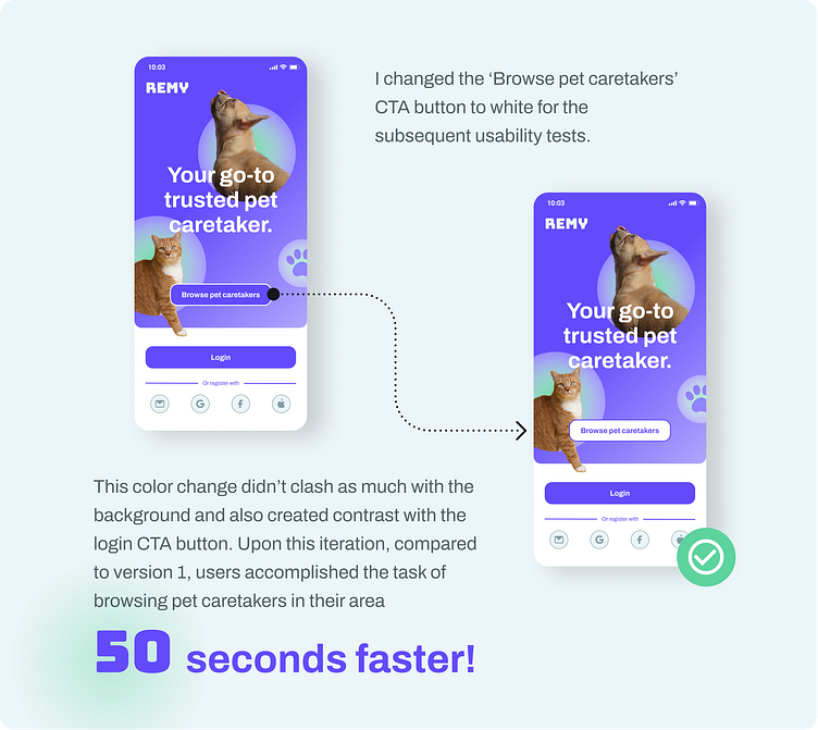
Testing my prototype with users was one of the most insightful steps during my design process. I was able to observe the speed and ease at which the participants navigated the flow. Overall, the simple and intuitive design was a success across user tests, resulting in most users accomplishing their tasks in under 30 seconds. But during the first usability test, something wasn’t quite right with the homepage. One of the CTA buttons was not very easy to find for the user so I went back to the iterating process.
Try the live prototype, split into two different tasks:
Takeaways
It was such a rewarding experience working through all stages of designing a product that aims to enhance and empower a user’s needs. The work is never done and this project has taught me that there can be so many different solutions to the same problem. One seemingly small design decision like changing a color can create a domino effect of enhancements or even the other way around but going back to the process, iterating, and reminding myself what were people’s goals and frustrations to begin with is key in order to design for the better.
Learning doesn’t stop here. Currently, I look forward to creating more digital experiences and collaborating with a great team!