Walkies: A Dog Walking App Case Study

My Role - UI / UX Designer
Duration - 3 months
Tools - Figma, Pencil and Paper, Google Form
Design Process - Market Research, User Research, User Flow, Wireframing, Prototyping and Testing
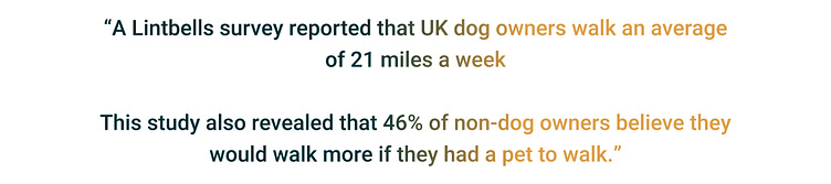
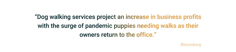
Research - Quantitative
Hey! Welcome to my UI / UX case study! 👋
Question, don't you think dog owners sometimes need better accessibility caring for and walking their dogs? Well...
Problem Statement 💭
How can we create a service to connect dog owners with dog walkers, whilst looking at how I can help dog owners trust their dogs are in safe hands?

Solution💡
To create a service that connects dog owners with dog walkers and builds trust between them, I tried to consider the following solutions:
Thoroughly screen and vet dog walkers: Implement a rigorous screening process for dog walkers, including background checks, reference checks, and verifying their experience and knowledge in handling dogs. This step ensures that only reliable and trustworthy individuals become part of your service.
Detailed profiles and reviews: Create comprehensive profiles for dog walkers, including their experience, qualifications, specialized skills, and availability. Additionally, allow dog owners to rate and review the walkers based on their services. Transparent feedback and ratings help establish trust and provide insights for potential clients.
Certification and training: Offer certification or training programs for dog walkers, which cover various aspects such as basic dog handling skills, pet first aid, understanding dog behavior, and leash training. This not only enhances the walkers' expertise but also instills confidence in dog owners regarding their capabilities.
Initial meetings and trial walks: Encourage dog owners to arrange an initial meeting with the prospective walker to assess their compatibility. Offer trial walks where owners can accompany the walker for a brief period to observe their interaction with the dog. This allows owners to establish a personal connection and build trust gradually.
Dedicated customer support: Establish a responsive customer support system to address any concerns or queries from dog owners. Offer multiple channels of communication, such as phone, email, or live chat, to ensure prompt assistance. Quick and effective customer support enhances the overall trustworthiness of your service.
By implementing these strategies, you can create a dog walking service that not only connects dog owners with reliable dog walkers but also establishes trust and peace of mind among the owners, ensuring their dogs are in safe hands.
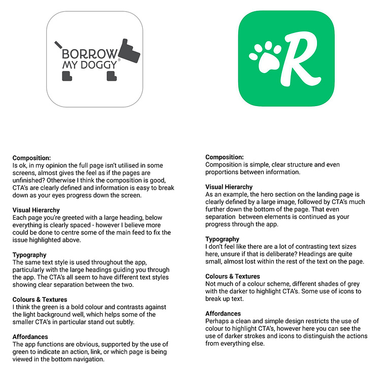
Market Research 🛒
The two applications I chose to research were the most popular applications used in my location, what I found here was a big contrast in the two apps. The first felt very outdated due it’s user interface, the composition to be exact. The second felt a bit more ‘with the times’, a clean and simple design with a clear path through the app. I also enjoyed how options was displayed in this application and tried to implement these positives into my own designs.
User Research 🔮
On big constraint I came across, was simply not knowing many people who use dog walking apps. So I thought the best way to have access to more people would be to virtually question them. So I created a Google Form and sent it out to my work colleagues to share. I collected data from 8 people which I was really pleased with.
The findings showed, most people were quite happy with their respective dog walking apps. Ease of use was quite a common positive. However, (to summarize), a lack of information regarding the chosen dog was a strong pain point.
https://forms.gle/a6wFeHqRXP65F2yBA

What are the key takeaways from the research?
It seems like experience is one take away from the dog owner perspective. Knowing how much experience a possible dog walker has. From the dog walkers perspective, a little bit of personal information about the dog would be useful. i.e favourite snacks, activities, behaviour etc. to gain an insight to the dog more and provide a better experience for both the dog and owner. Ease of communication and functionality of the app is a big plus.
Why I chose the Qualitative Reseach method
Qualitative research allowed me to gain a comprehensive and nuanced understanding of the experiences, needs, and preferences of the dog owners and potential users of the app. Through techniques like interviews, focus groups, and observation, I can delve into motivations, concerns, and expectations related to dog walking services. This deep understanding helped me tailor my app to meet their specific requirements effectively.
Furthermore, through this research method I could identify unmet needs or gaps in existing dog walking services. By listening to the dog owners' stories, concerns, and frustrations, I uncovered pain points that had not been adequately addressed. This knowledge helped me develop unique value propositions and innovative features that set my app apart from other competitors.
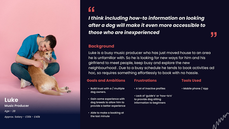
Persona 🙂
I focused on my User Persona’s frustrations as my problems to solve.
A young professional, who has a very busy diary and would like to book dog walking as a quick activity / exercise ad hoc.
User Flow 🧑✈️
Low Fidelity User Flow
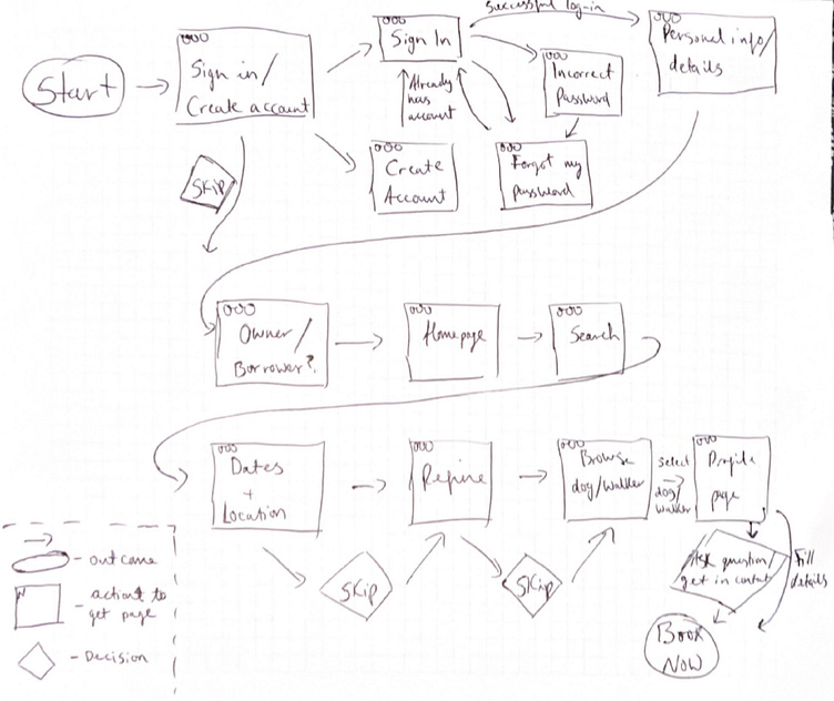
High Fidelity User Flow


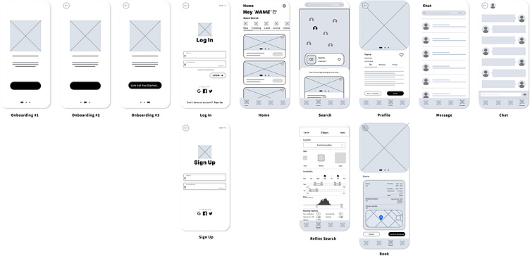
Wireframes 🖍️
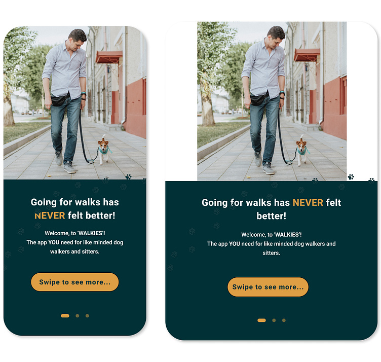
Personally, I don't like information being laid out in big ‘chunks’. So I opted for an onboarding system which gave information a screen at a time. I used google to find design ideas which I either really liked, suited the assignment, or designs I thought could be moulded to something appropriate. An example being Airbnb and their search screen in particular, showing multiple users on one screen without the need to scroll.
Low Fidelity Wireframe
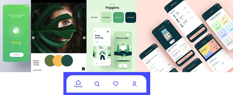
Wireframe Mood Board
I associated dog walking with words like: the outdoors, exercise, fresh air and greenery. This led me to a green colour scheme which I feel gives the sense of health and freshness, great for a dog walking app.
High Fidelity Wireframe

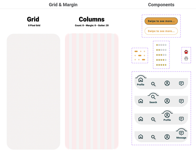
Scaling Design ⚖️

Visual Designs 👀
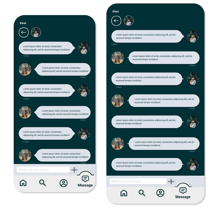
Using auto layout in Figma, I made my designs more flexible. So, should my screens need to be enlargened, for a tablet for example, this would be possible wihout the need to amend the elements on the page.

Prototype + Test 🧪
Still relatively new to prototyping at this point. Whilst I found prototyping easy to use, I didn’t design every single page which would eventually be used this in app (due to time constraints), which meant I found it difficult to link consecutive pages.
I sent my prototype to the same individuals that provided my user research, and asked them to highlight any pain points they had when navigating through my app, this helped validate / invalidate some of your design choices.
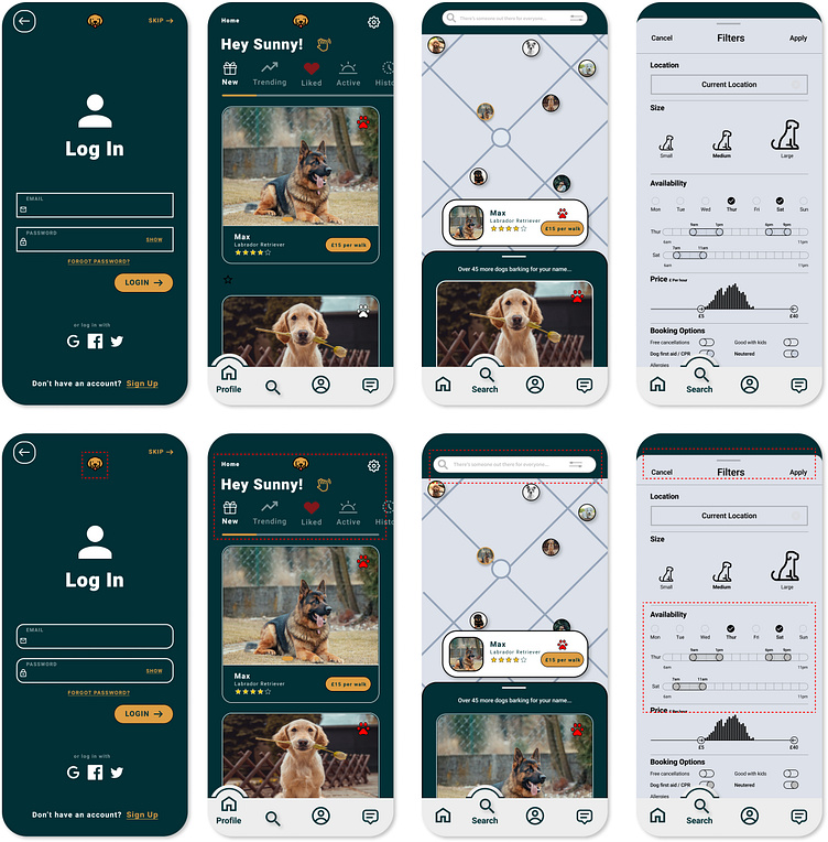
I didn’t factor in the iPhone selfie camera at the top of the phone, which blocked a few elements. however my user feedback was very positive, a few points highlighted were:
Move search bar at the top of the ‘Search’ page slightly down to miss the iPhone selfie camera.
Space the ‘Availability’ section out horizontally on the ‘refine’ option on the ‘Search’ page.
Outcome / Results 🛬
This was my first full case study employing both the UI and UX skills I had learnt. I was juggling a lot in my personal life as well as this course, so with more time I would have liked to have taken more care on the prototyping phase and scaling side of the project. I feel like I could have used the style function earlier which would have saved me more time in the long run. Nonetheless, I take pride in my mistakes and know what I need to improve on going forward. However, as a whole I was really pleased with my work and even happier with what I learnt.