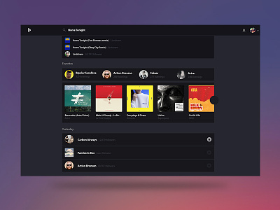
Bitzik - Search UX exploration
Dear guys,
today i've made some research for the future search engine of Bitzik.
It's based on Inbox.google.com inspiration.
When the user click on the search field, the bar takes all the nav and hide the menu. Then, a timeline of history from the user's research appears. When the user tape something the timeline fade out and let a lot of boxes linked to the active research.
I will improve the ux and put for e.g. a back arrow to remove the search. I love the way the user can cancel the search by clicking on a blank space at left or right of the timeline.
I love the UX of google and all the research behind.
More by Benoît Philibert View profile
Like

