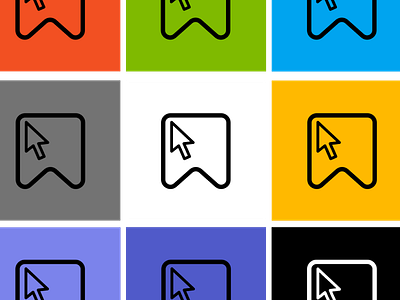
Handbook Lab Logo Designs
Lots of preparation went into designing my logo for my new venture (side hustle, or whatever you want to call it) launching January 2023.
The thought process behind the logo design was to find a symbol that succinctly represented the Handbook Lab; a place for consumers to watch [videos], read [training handbooks], discuss [via the membership community] and download [free and paid] educational training content.
The idea behind the design came about after drawing lots of designs including handbooks, pencils, laptops, etc and looking at the colours that used by the technology companies behind the software that I’d be making content on.
I chose this design as I felt it was simple and identifiable. It is a bookmark and a cursor. The ‘bookmark’ symbolises my intention to give people a central place to locate all the training they need, and the cursor represents my ambition to create a website/YouTube channel that consumers want to click on. I felt the two logos sat well together, because when combined, they symbolise my goal to create a training space that engages the user to learn, share and return. My motto is “training doesn’t have to be boring”; I hope to prove this throughout 2023 as I build my website and YouTube channel.
