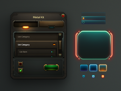
Basekit
Art for the sake of having art is something I struggle with as an artist (striving for cool and detailed concepts) because I consider functionality to be more important. Especially with the rise of minimal (flat) UI art & design somehow bleeding into game interfaces. I feel it's important to have a rule set for the overall look and feel for any given game interface.
Here is my attempt at making a game interface as immersive as possible with a controlled use of style. This is absolutely necessary for an MMO (PC) with tons of systems and windows. The art direction (handled by me) and goal was to make buttons stand out from the framing and provide distinctions (although minute) for each style.
The metal kit (sharp edges) was primarily used for your typical high content window while the hologram kit (round edges) was limited to modals, HUD & alerts.


