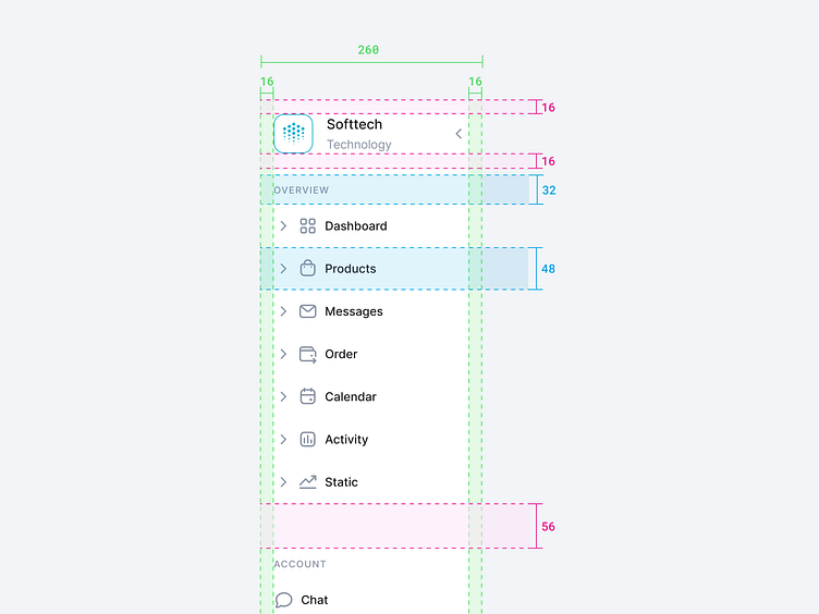
Side Navigation UX
Hey Dribbblers 🏀,
Vertical navigation supports more efficient scanning than horizontal navigation.
We know from eyetracking studies that attention leans left on websites: users look at the left half of the screen 80% of the time. The real estate on the left side of the screen is valuable, and placing your navigation there makes it likely to be noticed and scanned by your users.
Additionally, research in psycholinguistics shows that visual search in a list is more efficient if the list is vertical than if it is horizontal — people are able to find an item of interest with fewer eye fixations, simply because much more information can be derived from a single fixation. (Remember that the eye is able to perceive information not only from the exact location where it fixates but also from a relatively small area around it. As a result, even when we do read every single word in a sentence, we need to fixate only on a few of them.)
Read more about case study on Medium:
https://medium.com/ux-planet/case-study-research-sidebar-navigation-b41272026c6d
Don't forget to press "L" if you enjoy watching this ❤️.
Thanks for checking it out!
If you have comments, let me know!
Say hello at 📧
ux.sergushkin@gmail.com
Visit my Website 🌎
dmitrysergushkin.com
For more inspiration, visit my profiles ✨
