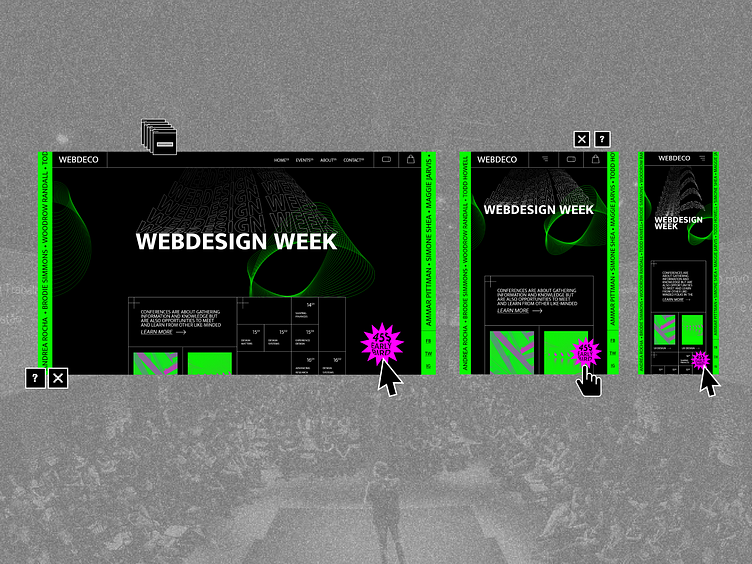
Web-brutalism and fluid typography
The UI/UX design world has gradually come to be dominated by guidelines and aesthetics belonging to companies like Apple or Google, which may feel that everything is slowly starting to get homogenized.
Web-brutalism references Brutalist architecture, which was a 50's to 70's movement that chose to stay away from decoration - from architectonic ornaments to simple wall-paint, expressed through massive, solid structures, with exposed concrete and sometimes exposed architectural plan. The idea was that the buildings were honest, unpretentious and anti-bourgeois.
Web-brutalism is no different from brutalism in the sense that it not only embodies a counter-reaction - in this case, to standardized visual design - but also manifests itself through a sense of roughness, exposed structures, and visible thought processes..UX wise, the raw, "original" Web-Brutalism will straight up ignore all the User Centered Design principles, but there are a lot of examples such as Dropbox, Gumroad or Bloomberg showing that user-centered design doesn't need to be monopolized by the same colors, same buttons, same photography. Source: imaginarycloud