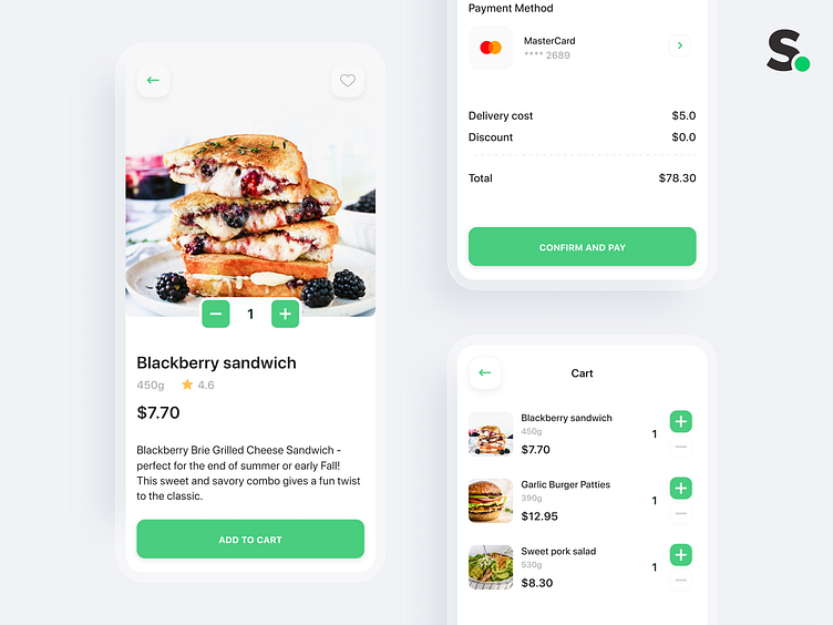
Product card
If you are interested in what to consider in the product card design I have some tips. The main thing is of course good quality photos. Nice to have a carousel with multiple product shots. Also, you must have a descriptive product name that should reflect details. The next item is cost and it should be indicated per item. Then you need to display product descriptions or parameters, ratings, and reviews. And the main thing here is the buy button. It can be adding to the cart or a quick purchase but it always has to be right on the screen. The product card can have more additional information that helps answer all the questions of the users.
___________________________________
Designer: Oleg Volovnyk & Andrew Rydvansky
We assist those who need a business-oriented team 100% focused on the result. And cover an entire Development Cycle along with Quality Assurance and Automation Testing. Let's talk!

