Landing page design for Design agency
If you like my project support it with like 💜
See the full project on Behance
What do you need to know about this website?
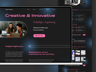
The genius is in the simplicity - rounded rectangles and circles.
This job was about creating an attractive website design without using a huge number of different illustrations and other elements. I managed to replace the usual pictures with seemingly ordinary shapes, but the way they fit into the concept of the site fully justifies my decision.
Colors: The main accent color of the site is pink, while blue is used for individual elements and decor. These colors contrast with the dark background, and white has been chosen for the texts.
Fonts: The heading font (Zen Dots) was chosen in order to diversify the overall look of the site, making it "technological" at first glance. The second font (Raleway) is quite simple and was chosen so as not to overload the site.
If you would like to discuss your project with me, please contact me via:
