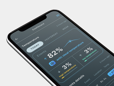
Dark theme Tracking Dashboard on Mobile
How do you feel about the Dark theme 🌙 for dashboards? Some may think is only a trend, while it presents some advantages for low-vision users. Although, Light mode 🔅 leads to better performance most of the time.
We designed a dashboard to track kegs' temperature. Where the users can take a quick look at the latest states of the beer kegs 💥
That is why the mobile version 📱 is a must for the project, the user needs the information along the way. The dark theme version brings help in the visibility in daylight.
Press L if you like our design and share feedback!
➡ Check our other views of this project in Dribbble
➡ We share some useful templates on Figma
More by GM2 Design View profile
Like
