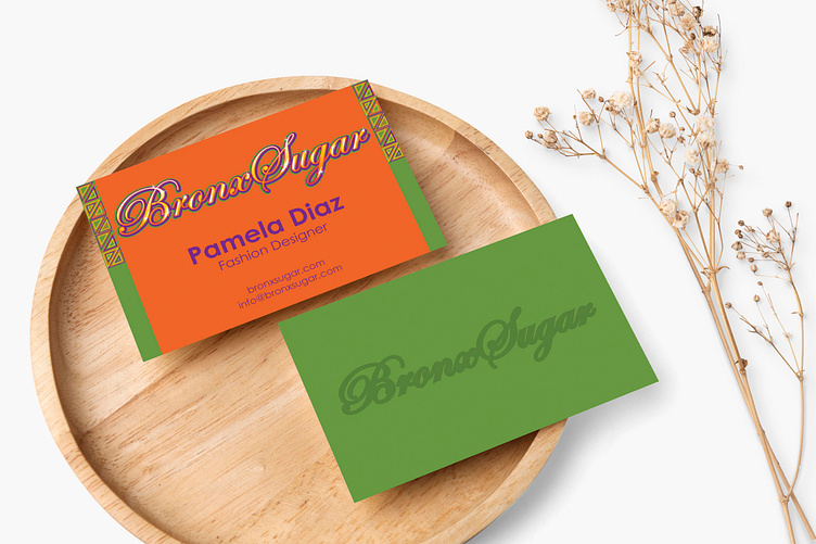
Bronx Sugar Business Card
This design and the next two in my profile were part of a project for an upcoming clothing brand called Brand Sugar that sells urban and afro urban apparel and accessories. Afro-urban fashion is a combination of street and African styles. It's also heavily influenced by hip-hop. This project was quite challenging for me and required research on my part because even though, I've seen the style before, I really wanted to make sure I understood it perfectly to get it right. It was actually really fun! After Pamela, the owner, completed my contact form, I scheduled a phone call with her and learned a lot about her plans for the business. She was looking for a logo, business card, envelope, and thank you note to help her get started in the world of fashion. She loves hip-hop and the fashion styles that are influenced by it. She also loves Africa and likes to incorporate prints into her wardrobe. She wants black people to love their roots and never be afraid to express themselves boldly. In the future, she would like to own several stores across the country to keep black culture alive.
For the fonts, I chose Edwardian Script ITC and Century Gothic. Pam mentioned that her main target audience is women so I went with Edwardian as the main font because it's very feminine. I also wanted to use a font that is eye-catching to match the boldness of this brand! For the secondary font, I chose century gothic because it's quite the opposite. Edwardian makes such a big statement so pairing it with a comfortable, extremely legible font works so well! As for the colors, I went with a bright palette. African clothes have loud colors. They often use more than two so I used four to keep things interesting. I experimented with three but it felt like it was not elaborate enough. I started with a strong purple because it's the color of creativity and power. I wanted these attributes to be on the customers' minds because I want them to feel confident and unafraid to step outside what's comfortable. The next two colors I chose were yellow and orange because they remind me of a sunset over the horizon in Africa. Think of that hazy photo of a sunset with a giraffe on the right side. The last color I chose was green because Pamela mentioned she wanted a hue that's similar to money so that it matches an illustration of a cartoon version of her holding cash.
For the logo, I decided that the main colors would be orange and yellow. Orange is the color of optimism and happiness. According to Adobe, brands use orange to get people excited about something, which is exactly what Pamela needs to break into the fashion world! I also added yellow to create a gradient effect that graffiti artists often use. I used yellow because it's the closest to orange on the color wheel and I didn't want to take away from it, only add it! The green and purple are used for the outline to add depth because they're the darker colors and I wanted a contrast with the brighter ones. Purple is the biggest outline because it's the darkest of the two. Finally, I finished it off with white strokes and sparkles to create a shine and gloss effect, often a staple for graffiti art!
I started it off with an orange background for the front because I wanted a bright color but I don't want it to take away from the logo, which is why I didn't choose yellow. I didn't choose green or purple either because it would make one of the strokes in the logo disappear. Then I added a border to make things interesting. I made two columns to go on each side of the card with a triangular design to form a bold, colorful pattern. I went with triangles because they're a common shape in African patterns. I added smaller triangles within each one to make an even more intricate design. Then, I stacked them up to create columns but I stopped at the foot of Bronx Sugar because if I brought the pattern down, it would compete with the logo. For the color of the text, I contrasted the background with purple because green, the second darkest color of the palette, will be used for the back. For the text itself, I simply added Pamela's name and her role in the business since the card is busy enough. We don't want to complicate things. Inspiration for the back of the card came once again from Pamela's illustration. The background was set to money green with the logo in a darker green. This is to display that the logo will have an embossed (raised text or 3D appearance) effect when it's printed. This is the final icing on the cake to make it pop! Hip-hop and afro-centric culture alike is about making a statement!
