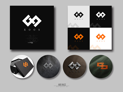
XOOS - Men's clothing & footwear Brand Identity Design
Company Name: XOOS
Company Details: Men's lifestyle brand (footwear+clothing)
Little Talk about Concept:
I wanted to make something 'Minimal, Iconic & Meaningful.'
That's why I choose the icon of 'BOW TIE' to represent the brand for Men's lifestyle in a powerful, symbolic, elegant & decent way. I also focused on the name of the brand 'XOOS.'
I designed the bow tie icon with shapes which will represent the brand name in a iconic way.
And all of these designs are made with 'GOLDEN RATIO' shapes. I think It's balanced and eye catchy.
And there's nothing serious about color. any solid color would be perfect. I prefer the black & white color. To me, it's more manly, stylish & iconic. I also tried the light orange color, this color will represent the energetic vibe of men. feelings of friendliness, good health, and are soothing. This color will also express the feelings of friendliness, good health, and are soothing.
Used tools:
Adobe Photoshop, Adobe Illustrator, Graphics Tab.
Feel free to contact with me for any kinds of Design.
My Facebook ID: Abs RaZz.
Facebook Page: ABS RaZz.
Thanks.
