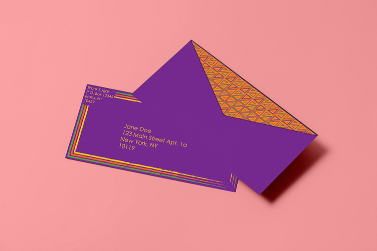
Bronx Sugar Envelope
For this envelope, I went with a purple background and yellow letters to match the thank you note. Of course, I used Century Gothic for legibility. (For privacy reasons, the addresses are fake) I also decided to give it a border because I wanted to be consistent with the business card. But instead of using the same border, I used a stroke that looks drawn and more heavy-handed in some areas to make it look modern. I used the other three colors to make three borders to once again create a pattern. On the back, I used the same design as the business card for the entire flap of the envelope for consistency and distinctness. For this last design, I wanted to combine simplicity and embellishment to tie the three together. The business card is decorative, and the thank you note is minimalistic, so I wanted to put these two contrasting styles together.
Image by Freepik
https://www.freepik.com/free-psd/top-view-dark-envelope-mockup_26930015.htm
