Logo Rebrand
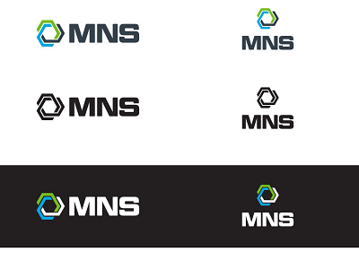
As part of the rebranding effort for the firm's 60th anniversary, a new logo design was created. Here is the final version in both a horizontal and stacked position. The logo design through final approval was a huge effort. We designed many iterations before final approval. The website design could not begin until the logo was finalized. There were many long, sleepless nights working on this rebrand as the 60th anniversary date quickly approach. We met our deadline two weeks ahead of schedule.
The logo icon evolved from a survey scope, which represented MNS' survey roots dating back to 1890 (prior to being established as a C-Corporation in 1962), to the current infinitely interlocking geometric shape in the rebranded logo. The center hexagon, one of the strongest shapes in nature, represents the strength of MNS' core services and markets today. The interlocking design with no beginning or end represents MNS' effective professional collaboration between MNS staff across service lines and our seamless integration with clients and the communities in which we live and work. The outer layers of varied line lengths and color represent our commitment to nurturing a diverse culture where individuals’ abilities, experiences, and styles are encouraged, rewarded, valued, and shared in a way that strengthens both the individual, the team, and our project work.
Our new logo and icon represent the most significant value to our approach. We are a team, not one person. We believe in COLLABORATION! By working together across Civil Engineering, Construction Management, and Land Surveying groups, we find unique and robust solutions and deliver exceptional value to our customers.
We have made it our purpose to grow with intention as individuals and as a team. We are empowered by these changes and an overwhelming sense of kinship throughout our team. We know our team of diverse, talented, and determined professionals will continue to enable our clients’ success as well as each other’s success within our industry.
