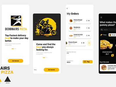
Case Study Debonairs Pizza
Hi Dribbble, Here is my new exploration of food delivery app design.
Here are some short steps for designing the UI/UX of a mobile app for a pizza delivery company:
👉 Determine the target audience for the app. This will help guide the overall design and content strategy for the app.
👉 Define the goals for the app. What do you want users to be able to do with the app? This could include things like placing an order, tracking the status of an order, and accessing special deals or promotions.
👉 Create a wireframe or rough layout for the app. This will give you an idea of the overall structure and hierarchy of the app, and will help you to determine what content and elements should be included.
👉 Design the visual elements of the app, such as the logo, color scheme, and typography. Consider the brand identity and personality of the pizza company, as well as the preferences and expectations of the target audience.
👉 Choose appropriate imagery and graphics for the app. These should be visually appealing and relevant to the pizza delivery service being offered.
👉 Write compelling and informative content for the app. This should include clear and concise headlines, as well as supporting copy that provides more detail about the app's features and functionality.
👉 Test the app to ensure that it is easy to navigate and that all elements are functioning properly. This could include usability testing with a small group of users, or using tools to analyze the app's performance and identify any issues.
Make any necessary revisions based on the results of testing, and then launch the app.
👉Continuously monitor and analyze the performance of the app, and make updates and improvements as needed to optimize its effectiveness.
👉 Project inquiry
🤝 Say Hello: email -wedisarah123@gmail.com
