#dailyui - Chapter 5 - Design an App Logo
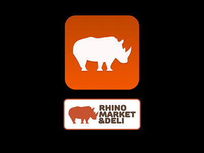
In my class I'm working on a project for this local store in my hometown - I never got around to creating the app logo so here it is!
I chose the darker color gradient for the top, and the lighter for the bottom in this project because it gives it that (semi) old school look of the app "sitting on a shelf" on the home screen. The three dimensional feel gives it a more modern look, and the very simple drop shadow on the Rhino gives the icon some depth for a better feel when opening the app.
Simple, but satisfying!
