Fintech app | bank
Hi everyone, 👋
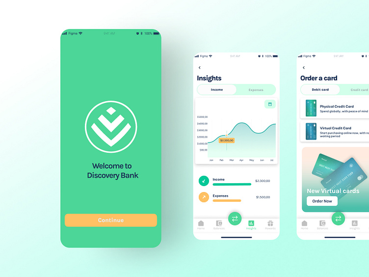
Here are a few screens for a fintech app/bank, with a 'welcome" screen, "insights" and "order a card".
The goal was to create a sense of trust (obtained by the blue/green tones) but with a fun and more approachable feel than that of traditional banking institutions (obtained with the yellow accent color).
Feel free to leave your feedback 👍
More by Sofia Dias View profile
Like
