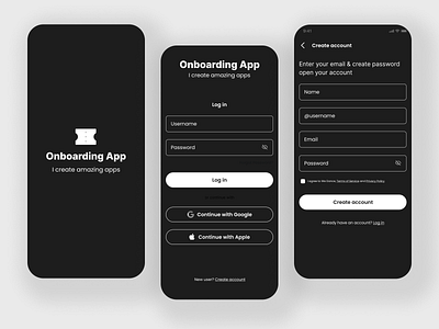
Modern and Engaging Mobile Onboarding in a Dark Theme
The mobile UI design onboarding screens that I created in a dark theme were meant to be an experimental approach to the traditional onboarding process on mobile devices. The screens were designed specifically for use on mobile phones, and were intended to introduce new users to the features and functionality of the app or website in a visually striking and engaging way. The use of a dark theme added a level of sophistication and modernity to the design, making it stand out from other onboarding screens that may use more traditional, light-themed design elements. Overall, the dark theme added a level of depth and contrast to the onboarding screens, making them visually appealing and effective at introducing new users to the app or website on mobile devices
