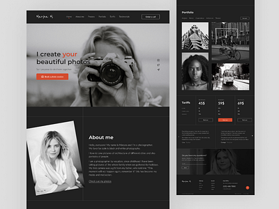
Photographer landing page concept
I like dark colors in the design, but there must also be a bright accent element. When choosing colors, I was sure that the main color would be dark gray, because the first photographs in the world were of this shade.
By the way, I prefer black and white photos, and you? Share your opinion in the comments 💭
I hope you enjoy it. Press "L"❤️ if you like it.
Thank you!
More by Maryna View profile
Like
