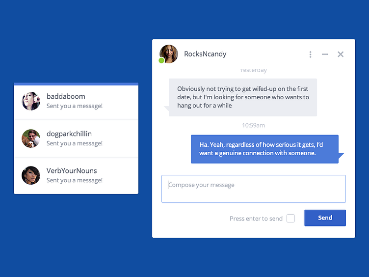
OkCupid Messages Redesign
This is a small part of a recent redesign to the OkCupid messages system that I worked on. Previously, when you sent a message from a profile, a modal window would appear at the top of the page, and if you wanted to reference what someone said, it would involve a lot of scrolling up and down the page. We decided to instead tack the message window to the bottom right side of the screen so it follows you down the page. This allows you to read the profile and compose a message simultaneously. Also, if you leave the page, the message window comes with you, and remains open as you navigate the site. This resulted in a nice bump in the number of overall messages sent.
This project was a lot of fun to work on, and I'm pretty excited to see it in the wild.
