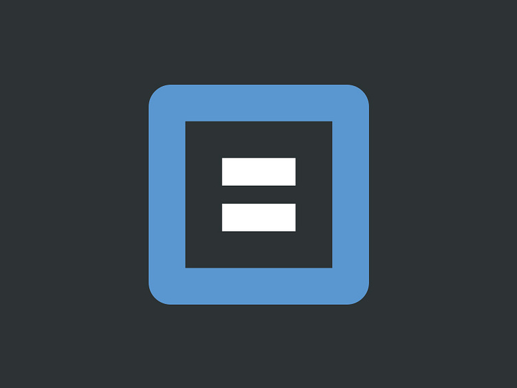
Blocs Logo Rebound
I really admire the work of @Norm having recently found out he's the brains behind products I've bought and used.
Saw that he'd had some run ins with the law regarding his logo that I love so quickly threw this together.
Keeps the form and block square of the previous logo iterations which I feel are important to the brand.
Switched to a capital B created out of the negative space and took inspiration from the menu system Norm was playing with in his Third version of the logo.
Keen to here peoples thoughts, especially @Norm :)
Note: I just broke a two year Dribbble sabbatical to throw this shot.
More by David J Hill View profile
Like
