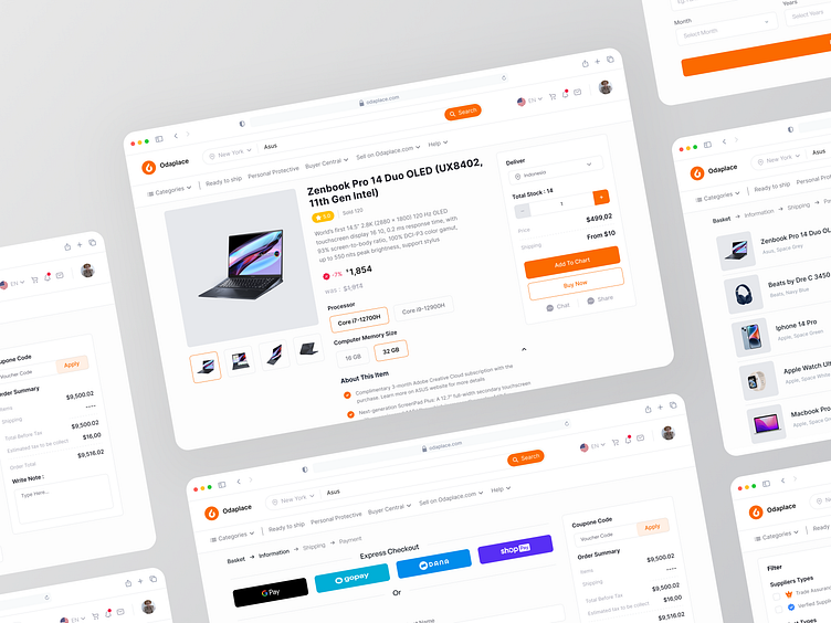
Marketplace - Flow Checkout 🔥
Hello everyone! 👋
I’m going to showcase how the checkout process can be usable and enjoyable whilst we can reduce the likelihood of errors. We need to tackle the flow from user’s point of view and determine how to improve the design through effective information architecture, interaction design, and/or visual design. Started thinking about how to make an easy flow to make users comfortable using the application, starting from searching for products until they already get the products. The following is the page detail page & the user process in checking out the product.
Interest to partnering with us? Say hello at hellodama@odama.io or visit our website odama.io
Check us more at:
📷 Instagram | 🛒 Gumroad | 🎉 Figma Community
More by Odama View profile
Like


