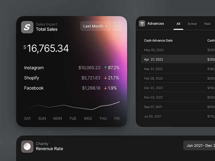
Cards & Components — Dark
Hey all,
Sharing first insights from the collaboration together with Wayflyer . We got tasked to revamp Wayflyer's product suite, with an aesthetic preference and a high focus on maximising usability and accessibility.
Breaking down barriers for eCommerce
Since Wayflyer was founded, they’ve talked to hundreds of eCommerce businesses. They asked them about the biggest problems they face and what keeps them up at night. They listened. And they acted.
Wayflyer exists to solve these problems. By providing funding and insights, they are breaking down barriers for eCommerce companies, helping them to grow faster and achieve their potential.
A key part of our work with Wayflyer involved the design of a mobile application. Following the principle of an aesthetic preference and a high focus on maximising usability and accessibility allows us to create an experience that unites flexibility, efficiency, and aesthetic values.
The mobile application had to display all the information the user would find on the desktop app. To achieve this, we went for a simple and clean approach that adheres to our sophisticated design standards.
The result: an optimised user experience to have on-the-go.
____________________________________________________
🟢 Open for work.
I would love to hear about your idea.
📭 Reach out via mail: hey@kevdu.co
⚡️ Follow on Twitter for more detailed updates.
____________________________________________________


