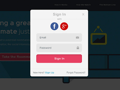
Login Modal
Working on a login modal that leverages logging in via Facebook or Google+ as well as traditional email and pass. The goal is for users to sign in via Facebook mostly because of the awesome features that come with it over Google+ or traditionally.
What do you think? Are the icons in the input text fields too much? What about the gradient on the button with such flat design surrounding it?
More by Maigen Berg View profile
Like
