Gwallet Branding
About Gwallet
Gwallet is a modern and sleek digital wallet that aims to revolutionize the way people manage their finances. With Gwallet, users can easily store, track, and transfer money from a single, convenient app.
The Gwallet brand is all about simplicity, convenience, and security. The clean and minimalistic design reflects our commitment to making financial management easy and hassle-free. The use of bold, vibrant colors helps to add a touch of personality and energy to the brand.
The logo, the letter "G" represents the global nature of Gwallet and its ability to connect users from all around the world. Also symbolizes protection and security, emphasizing our commitment to safeguarding our users' financial information.
Overall, the Gwallet brand is about empowering people to take control of their finances and make the most of their money.
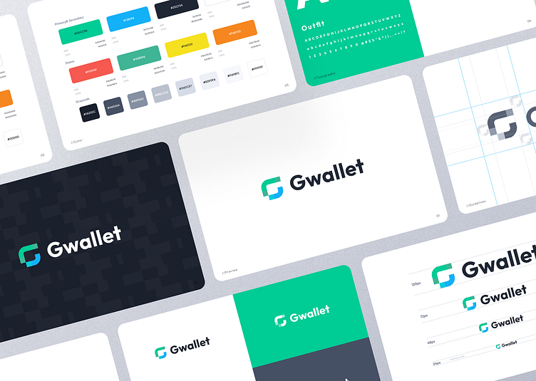
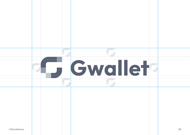
Logo Grid
A logo grid is a layout tool that helps to ensure that a logo is used consistently and effectively across different materials and platforms. It typically consists of a set of guidelines and guidelines for the placement and size of the logo, as well as rules for how the logo should be used in combination with other graphics or text.
Using a logo grid can help to ensure that the logo is consistently positioned and sized in a way that is visually appealing and effective. It can also help to create a cohesive and consistent brand identity, as the logo will look the same across different materials and platforms.
Overall, a logo grid is a valuable tool for ensuring that a company's logo is used consistently and effectively to represent the brand. It helps to create a cohesive and consistent brand identity and can make it easier to use the logo in a variety of materials and platforms.
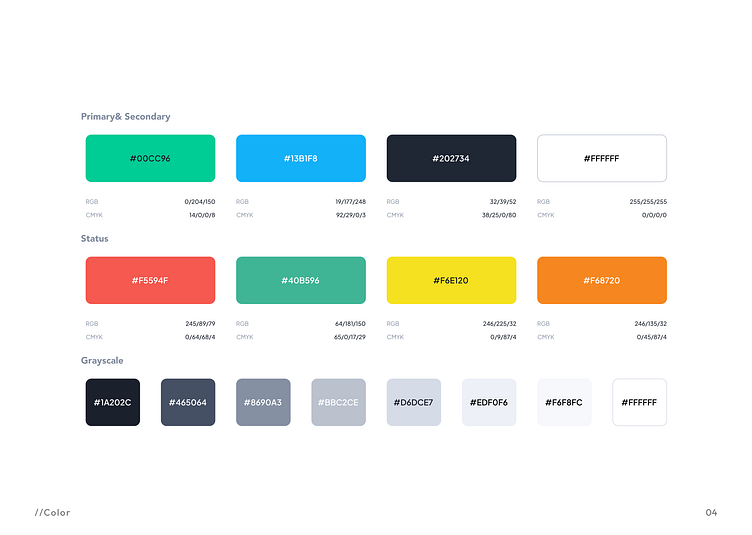
Color
The primary color for Gwallet is green and the secondary color is navy blue, the brand would have a fresh, modern, and professional feel.
The green color represents growth, prosperity, and abundance, making it a great choice for a financial management app. It is often associated with nature and sustainability, which can help to convey a sense of responsibility and ethics.
The navy blue color adds depth and sophistication to the brand. It is often associated with trust, loyalty, and intelligence, making it a perfect choice for a financial management app. The navy blue color also pairs well with the green, creating a cohesive and cohesive color palette.
Overall, the combination of green and navy blue for Gwallet would create a brand that is professional, reliable, and trustworthy.
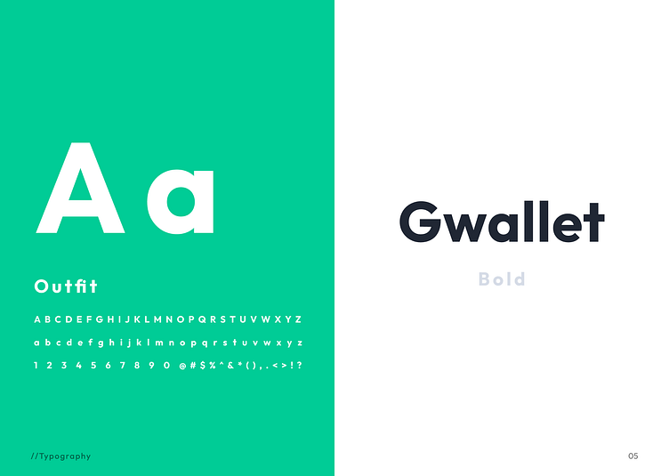
Typography
The outfit is a modern, sans-serif font that is known for its clean, minimalistic design and strong, geometric forms. It is a versatile font that can be used in a variety of contexts, from headlines and logos to body copy and user interface elements.
Using Outfit as the typography for Gwallet would help to create a modern and sleek brand identity. The strong, geometric forms of the font would complement the clean and minimalistic design of the app, while the pulse visible design would add a touch of personality and energy.
The outfit is a highly legible font, making it a great choice for use in digital products like Gwallet. Its strong, visible design would ensure that the app's text is easy to read and navigate, even on small screens.
Overall, using Outfit as the typography for Gwallet would help to create a cohesive and modern brand identity that is easy to read and navigate.
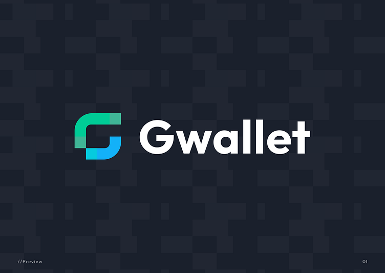
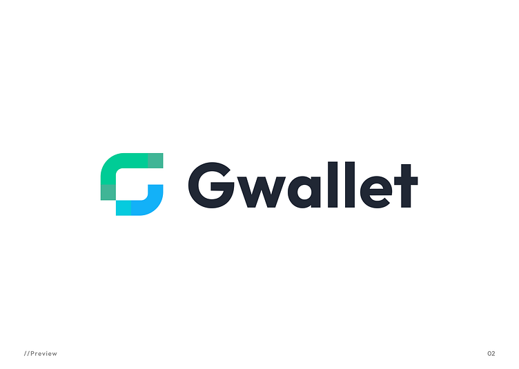
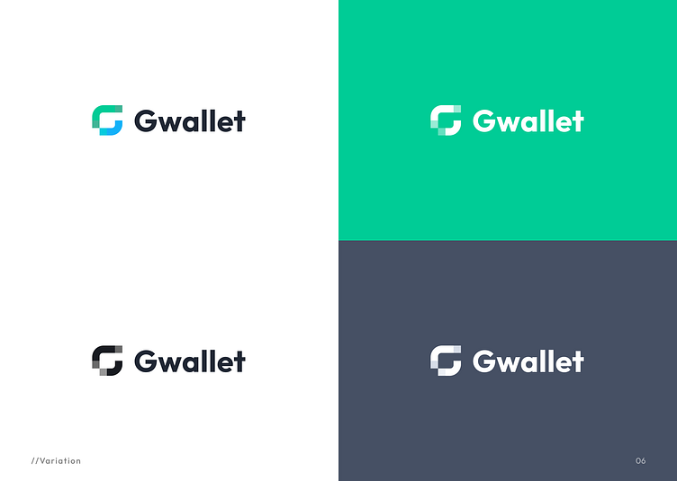
Logo Variation
Creating light and dark variations of the Gwallet logo can be a useful way to ensure that the logo looks good on a variety of backgrounds and in different lighting conditions.
For the light version of the logo, you could use a pale or pastel version of the primary color, such as a light green or light blue. This version of the logo could be used on light or white backgrounds, or in situations where the lighting is bright.
For the dark version of the logo, you could use a deep or saturated version of the primary color, such as a dark green or dark blue. This version of the logo could be used on dark or black backgrounds, or in situations where the lighting is low.
Using both light and dark versions of the logo can help to ensure that the logo is legible and visible in a variety of contexts. It can also help to create a cohesive and consistent brand identity, as the logo will look consistent across different materials and platforms.
Overall, having light and dark variations of the Gwallet logo can be a useful way to ensure that the logo looks good in a variety of contexts and lighting conditions.
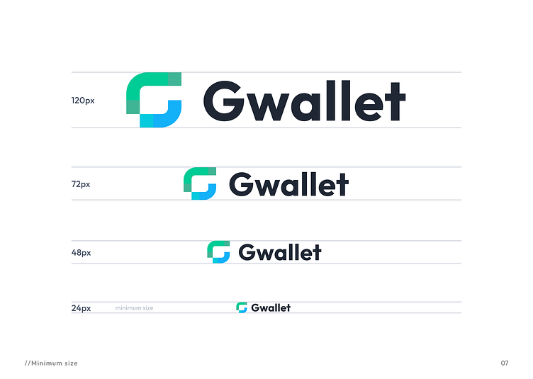
Gwallet logo Scale
Scaling the Gwallet logo from 120px to 24px can be a useful way to ensure that the logo looks good and is legible at different sizes.
When scaling down a logo, it's important to consider how the design elements will look at smaller sizes. Some design elements, such as fine lines or small text, may become difficult to see or read when the logo is scaled down. In these cases, it may be necessary to adjust the design or use a simplified version of the logo at smaller sizes.
It's also important to consider the resolution of the display where the logo will be used. At very small sizes, the logo may need to be designed at a higher resolution to ensure that it looks sharp and clear.
Overall, scaling the Gwallet logo from 120px to 24px can be a useful way to ensure that the logo looks good and is legible at different sizes.
By considering the design elements and the resolution of the display, you can create a logo that looks great and represents the brand effectively at all sizes.