Mammoth Rebranding
Mammoth Rebranding.
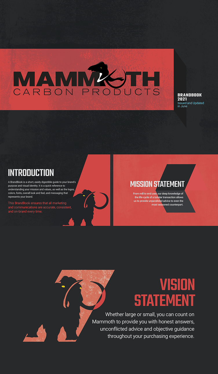
Mammoth already had their logo and colors in place but no branding. After looking at a few directions I decided to use their logo as a main element for their brand to give it a bold look.
I absolutely love using texture to give brands depth, and since Mammoth is from an oil & gas industry, the texture fits the brand perfectly.
Tell me what you think.
Hit like if you like and show some love :)
Follow for more work!
More by Paridhi Thakur View profile
Like


