WL Grace Church — Website Redesign Case Study
Project
In my experience, I have found the majority of church websites out there are not very well designed. They tend to become outdated and frustrate the user because they can't find the information they need. This is one issue of many.
The goal of redesigning this church's website was to increase overall traffic, gain user retention, simplify the interactions, and elevate the interface.
Steps
As the only designer on this project, I productively organized everything into individual steps, making it easier to tackle. I began by conducting research, looking to understand why their current website was lacking attention.
After identifying the pain points in the website, which included poorly designed layouts, broken links, confusing navigation, etc., I began designing solutions to address these issues.
Over the course of a many months I made user flows, journey maps, conducted a survey for the congregation on usability, tested prototypes, and had many meetings with my manager and the pastors.
Findings
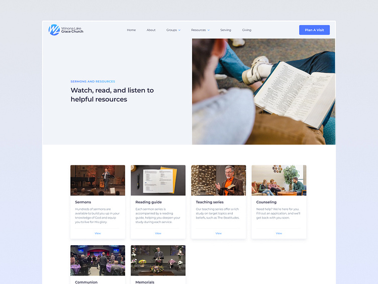
I found out the new website needed to be pointed less towards the congregation, and more at the community. The church had great communication with the congregation in person and through email updates. However, the website is the first impression for those outside the church, and their website lacked that initial focus.
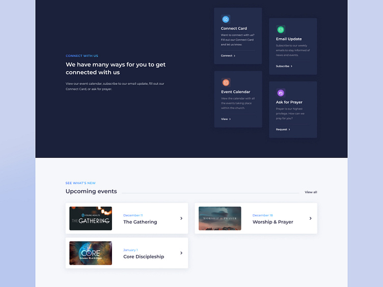
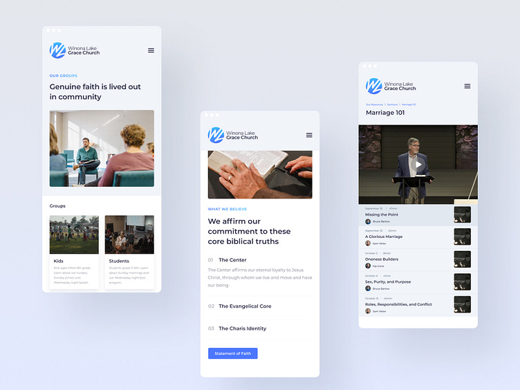
The redesigned website has a clear call to action in the hero. Either join us in person, or join us online. The information on the home page all the way down includes clear calls to action, whereas before there wasn’t any.
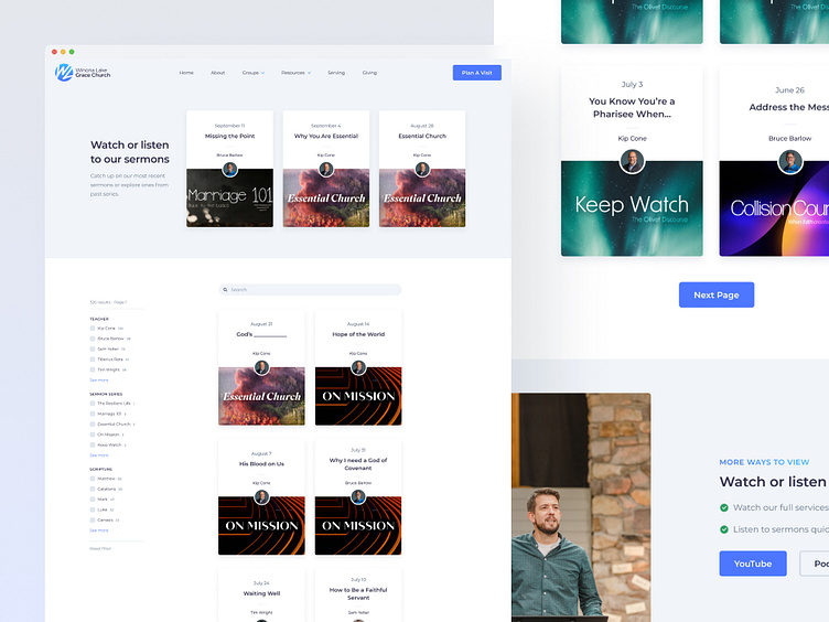
To improve the experience for those in the congregation, we added the most recent sermon directly on the home page, since this is what most returning users came to the website for.
Data
After publishing the website and having a month worth of data, I can conclude that the redesign was a great success. Alongside the redesign, we focused on improving SEO and mentioning the website more in our marketing.
The previous website had an average of 163 unique users per week. Comparing this to the new website, the average has been 282 unique users per week. That's a massive 173% increase.
Another issue of the website was the bounce rate at a whopping 90%. Comparing this to the redesign, stats went down to 47.7%. That's about a 42% decrease.
Development & release
You can view the live website here. This project was built out in Webflow by a design agency that I effectively communicated with for a few months.
The ultimate goal of the project was to provide a better user experience throughout. Working on this redesign has taught me how to conduct user research, effectively organize information, take initiative leading a large project, communicate with supervisors and developers, and create an overall more user-focused design.
