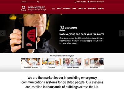
Deaf Alerter Homepage
Deaf Alerter wanted a refresh to their website and a refocus of their products. Currently, they have multiple websites for multiple products but they wanted one over arching website that listed products by their target audience i.e. architects, contractors, users at home etc.
As they have an amazing client base ranging from Royal Mail, to ITV to Waterstones I wanted to give the site more life using gradients and drop shadows, hopefully creating a more polished look that reflected the company, that flat design couldn't achieve.
More by Katherine Cory View profile
Like

