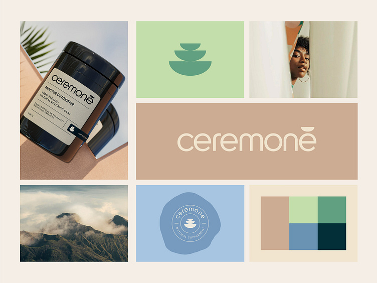
Branding & Packaging Design for Ceremone
What brings you peace on this brand board✌🏻?
Finding this answer takes only one look and paying attention to the way your heart🫀 responds to a specific part of this board. This harmony🧘🏻♂️ was created using earthy colours combined with the pastel shades associated with volcanic clay🌋. The combination of these colours🎨 builds a soft, natural palette with a calming effect on the eyes.
Let's work together!
— Do you have a project? 📩 projects@markaworks.com
— Visit our website to see all the project presentations.
The logo was also meant to create a balancing effect on the viewer's eyes👀. For this reason, we have selected a rounded sans serif font with a highlight at the end. This highlight represents the most harmonious part of the meditation ceremonies in Tibet, which is a meditation plate🍛.


