Smartville — Visual identity
Rebranding and visual identity design for Smartville
I've been approached by Smartville to complete a simple redesign of their visual identity. Smartville produces modular and standardized energy storage systems by repurposing domestic EV batteries, while capturing maximum battery value in a circular economy.
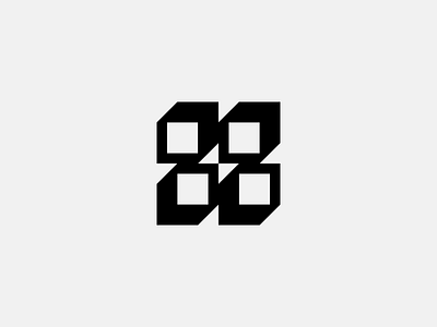
Smartville wanted to keep its logo's concept — four isometrically shaped cubes representing its energy storage system. By playing around with the existing concept, it's been noticed that a bolt symbol, which is a known symbol for electric energy, has been hidden within the logo concept, but needed to be brought to light. The bolt is now in the very center of the new logo, just like electric energy is at the heart of Smartville's mission.
The isometric cubes have been used as the key visual element to establish Smartville's visual language and have been replicated throughout its identity design.


