AliExpress logo

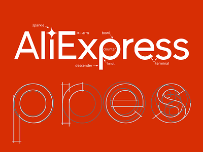
Sparkle out of the box. Besides it ehances visual focus on this logo
E- the three arms have different length to increase the balance of E.
p- knot- the bowl has a narrow width besides the decender. This makes the letter lighter.
Due to coventional rules in letter building, the counter is made up with two circles now. The perfect round will attract too much attention which is not optimal for reading.
e- terminal of e now has an open end optimal for reading since it helps readers connect e with s. Also it shares the same cut with s that unifies the personality across letters.
小火花:
突出顶端之外,有创新,创意的含义
E- 三个arms有不同的长度,这能使字体看起来更稳固
p- 在接近knot部位的地方,圆变得稍微细了一些,使p看起来更轻盈。Counter以两个圆组成,一般来说英文字体会避免完美的圆型,这会降低阅读性,并且会使p变得过于显眼。
e- e的结尾有一个开放的开口,使其更好的和后面的s产生连接。同时,有和s相同的terminal,这使得字体的个性可以延续。