Payment Form Design
The Challenge: Design a credit card checkout.
Background: This design was a Daily UI challenge that read:
"Design a credit card checkout form or page. Don't forget the important elements such as the numbers, dates, security numbers, etc."
Structural Design Considerations
I gave consideration to the following when deciding what components to include in the design of this form:
A status tracker: It clearly shows where the user is in the process of purchasing the product.
Order summary: I did an informal benchmarking study and confirmed that showing the order summary in the payment screen is common in many e-commerce stores. It is the approach Shopify has chosen to set as default for the stores the platform hosts.
Back-to-cart affordance: It gives the user an opportunity to modify their purchase before paying for their purchase. This is likely also the first time the user sees the total amount due with shipping and tax included. To ensure they can easily do so, I added an affordance to modify the cart, signified by the left-pointing arrow. The placement in the bottom left corner is intentionally inconspicuous - the signifiers has to be available to the user but not obtrusive.
Payment form: I kept the information the user needs to provide to complete the payment to the absolute minimum. My goal here is to minimize friction and speed up the checkout.
Payment button: It is intentionally placed in the bottom right corner - the ending position of the zig-zag eye scanning pattern across the form. The button is also grouped together with the input fields making it clear that clicking on it will take action on the information inputted in the fields. The text of the button lists the action "Pay" and the price, which makes it explicit what will happen once the user clicks on it.
Visual Design Considerations
In the visual design of the form, I gave considerations to the following:
Grouping: The payment form consists of two sections - Order Summary and Payment. I've used different background colours for each section. The colour serves to 1) signify each section and 2) group the elements belonging to the section. The elements having similar function are also grouped together (Law of Proximity, Law of Common Fate).
Grouping Sizes: The two cards (pink and white) follow the proportions of the golden rule with respect to each other (1.61x).
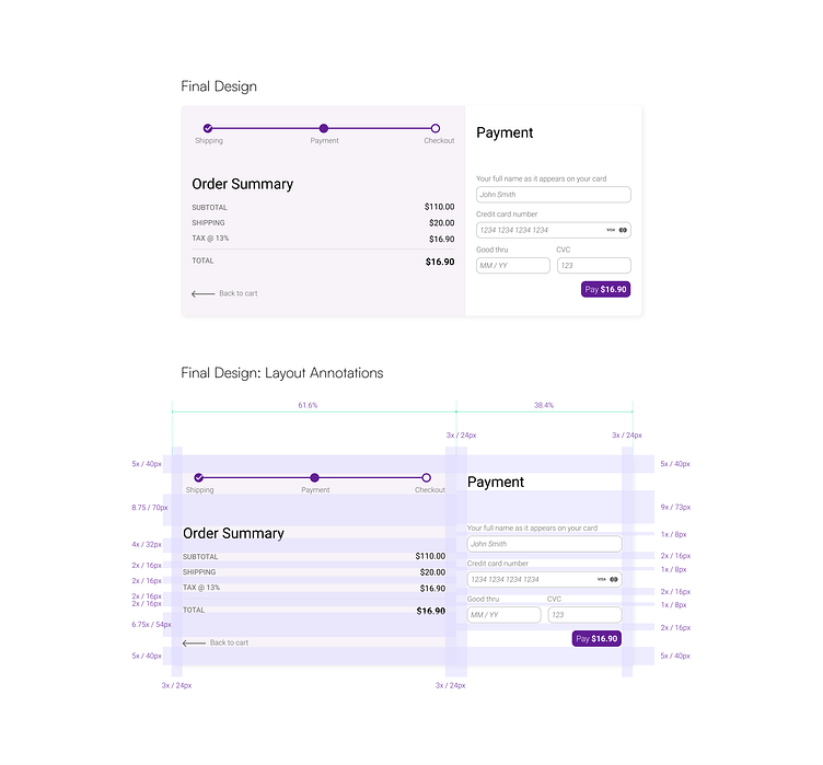
Layout: I've used the 8 pt system for the layout of the form. The space between each element is a multiple of 8 pt. The system allows for clean and symmetrical design.
Accent Colour: The accent colour is reserved for the button (to attract attention). The progress bar also uses the accent colour. Both elements are in the opposite corners of the forms and create an overall balance in the design.
Visual Hierarchy: I've used font size and colour to communicate importance of information (e.g. the prices are in a slightly larger font and black colour as compared to the category (e.g. Shipping, Subtotal, etc.). In reviewing the order information, the user is likely to focus on confirming the numbers - hence, my goal was to emphasize them.