Music Player App | Daily UI 009
Daily UI Challenge | Day 009
Today I was tasked with designing a music player.
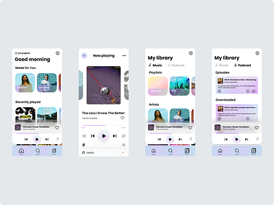
I defined my design scope for this challenge as designing an app for a user wanting to discover personalised playlists to listen to, add songs easily to a playlist, and navigate to their saved music and podcasts intuitively.
For the visual style, I chose a holographic colour palette. I drew inspiration from CDs from the 90s. The way light would filter through reflecting different wavelengths depending on the angle the light hit the surface. I liked this idea for a music-player as I imagine no single person's music-playing app would be the same, just as one person would never see the same colours reflected from the CD as their angle of view is unique.
I did some secondary research into what common UI patterns exist for music players to ensure that my music player was consistent with industry standards to improve the learnability of the app, minimising the need for the user to learn something new.
To allow the user to discover personalised playlists, the first recommendation of music on the home screen is a selection of daily mixes. The idea is each day, a new selection of 'daily mix' playlists are created to give the user variety and prevent them from getting bored day-to-day.
The user can quickly like songs using the heart icon found on the minimised player and the 'now playing' page.
From the 'now playing' page the user can add the song to a playlist using the icon on the bottom right of the screen. I aimed to keep all highly used actions related to listening to music within a natural thumb zone of the screen that it is easy for the user to carry out these actions.
The play button, next-song buttons, shuffle and repeat buttons are all aligned as they are the primary and secondary music control buttons. Below these, I placed the 'connect device' and 'add to playlist' buttons. Then I included a lyrics feature to delight the user so they can better engage with songs they love.
Something I didn't consider was the ability to share a song within the natural thumb zone. Instead of having this placed in the more settings sections, users may desire to have it placed to have it easier to access. I can think of plenty of times I got super excited discovering a song and wanting to share it with the world.
I included a minimal navigation bar to allow intuitive navigation to main pages of the app. Included is the 'Library' option that takes the user to their music and podcast library. They can toggle between their saved music and podcasts intuitively to help them navigate and manage their library.
Let me know what you think.
